Feeds:
Posts
Comments

Posts Tagged ‘interior decorating’

Candadian House and Home purple dining room

I don’t think I own anything purple when it comes to home decor. I only own a few purple clothing items. I like the color but it is a shade I find intimidating to work with. I don’t know why. I’ve found 2 very fun and slightly formal purple dining rooms that help me see the potential of purple.

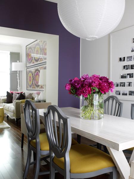
This first dining room is from Canadian House to Home. This room is a deep, royal purple shade. It feels light and airy against the white trim and the white wall. I love the mix of white accessories, including a thrifty white paper lantern. The colors paired with this royal purple make this color workable. I love it paired with that 70’s goldenrod shade and cool purpley cement gray. And and don’t forget the temporary pop of fuchsia from the fresh flowers on the table.This room is purple room that I can see easily replicated in a “real” home. Now to the other room…

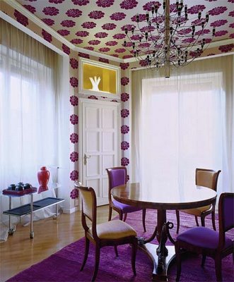
The other room I found on the blog, Roomenvy. This room is a bit more “busy” than the Canadian House and Home one. I love a bold and obnoxious wallpaper. So does the owner of this dining room. There is purple printed wallpaper on the ceiling. This isn’t that innovative, being that is a very old-fashioned thing to do. And may I add a bitch to remove. It too us forever in our dining nook to remove layers and layers of wallpaper off a small part of the ceiling. Anyways, I like this dining room because it is over the top, right down to the royal purple rug. This isn’t fitting for my home and I’m sick of seeing bold colored shaggy things. Do you remember our blue faux fur covered cabinets? Well, I do and I’ll

Patterned purple dining room

never see shag as something quirky or retro again. So, this room isn’t something that I see easily being replicated in a “real” home but it is fun to look at. I could easily see a “real” dining room incorporating this bold print on fabrics and maybe having a yellow/goldenrod painted walls.

Sorry about the lack of posts lately. I’m doing what I can to wrap up some of these projects before I go back to work. That’s keeping me very busy. And they’re boring projects too. Like cleaning, scrapping, touching up projects. These aren’t those creative projects that I crave.

-Victoria
Read Full Post »

Mess striped painted walls

"Messy" stripes from Living Etc.

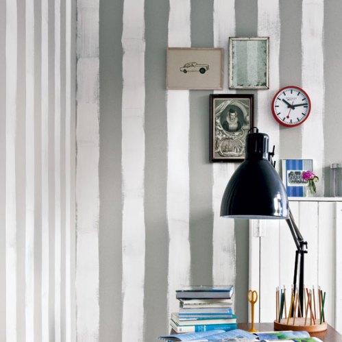
You guys know I really like painted or wallpaper striped walls. It’s a reoccurring them here on the Tudorks blog. I like stripes. They’re visually striking. I came across this gray and white room on Living Etc. I love the gray and white stripes, this is a nice neutral color combo. This office or studio is a bit masculine they way that it is decorated here, but you could pair this with a robin’s egg blue or pink to make it more feminine.

Yeah, gray and white = nice color combo. But, that isn’t what I really love about this little room. It’s the stripes. Love the messy, freehand stripes. This would be so easy to do. I can tell that the white was added over the battleship gray. Stripes don’t have to be perfect. And if you are a DIYer like us, then you probably won’t get perfect even if you tried. So this is “intentional” messiness. All you need to do is to get your spacing right, don’t worry about a crisp edge. I also like it in this Living Etc. room because it seems to be an office or a studio. We see art supplies and these stripes are creative, resembling an artist’s brush strokes.

So, what do you think? Do you think this would look silly and like a 5-year-old did it, if you saw it in person? Or do you think this adds a cute quirkiness to a room? I think it is a nice take on stripes. I won’t be doing it because stripes in general don’t fit with our home.

Today I’m fine cleaning the bathroom. My nostril hairs are singed from bleach. I’m hoping to finish this bathroom someday! And then we have a powder room to complete…I’ve also had a stupid day filled with spiders and smashing my thumb in a 1930’s solid wood door, the same door that broke my toes this time last  year.

-Victoria

Read Full Post »

DIY Picture Frame Shelf

shelf from Country Living

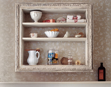
Here’s a really cool DIY shelf from Country Living. Since I found the picture, I’ve found it on many other sites too. I’m trying to find an easy way to incorporate storage in our super small 1930’s bathroom. I like this idea.  I always find fancy picture frames at thrift and antique stores. I don’t buy them because they don’t have glass and because I have to stop hoarding picture frames. (I never use frames). I also can control the depth of the shelf. This is the issue in our small bathroom. Pre-made shelving and storage is too deep. So, now I’m on the hunt for a nice picture frame. Like always, once you are looking for it, you can’t find it. Here’s the tutorial for the shelf on Country Living’s website.

I’ve been super busy trying to finish some of the loose ends around the house. The weather has been oddly cool, rainy, and fall like. This makes me feel like I’m missing out on summer but it makes me keep busy in the house.  Saturday was our 6 year wedding anniversary and our 1 year home ownership anniversary.  So, I’m trying to make up for lost time.

-Victoria

Read Full Post »

Maire Claire Maison great room

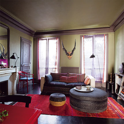
I love a foresty lichen green. Perhaps because I like fungi? Could be it, but these two rooms are tops. This first rooms is from Maire Claire Maison. It was a cool article that took an unbelievably beautiful space to begin with and gave it 3 makeovers. I like the lichen green one for many reasons. Like I said, this was a great room to begin with. It has dark wood floors in immaculate condition. The ceilings are tall and the natural lighting is breathtaking. And there are great features such as millwork, the fireplace, the door hardware. I love the lichen green walls with the milk chocolate brown trim color. This is unexpected and a bit “moody”. The red accents make the green color pop. I like the room because it has a  cozy feel. Open shelves make books accessible and the large ottoman acts as table. And I’m a fan or antlers/horns. You put those in a room and I’m in love. This room has a very “exotic” feel to it because of the color combination and the mix of objects and textiles.

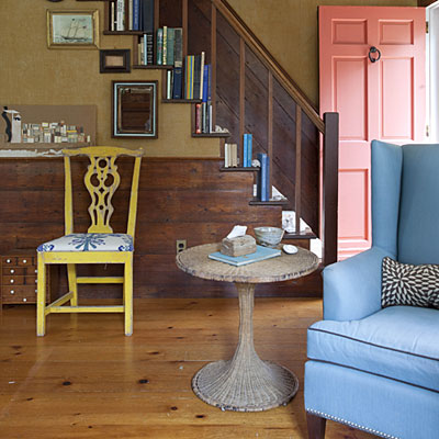
The other room, a foyer, was featured in Coastal Living. I love this room because the color combination is unexpected and I love this earthy green with wood tones. I also like this room because it is a coastal house that isn’t all light and white. I have been totally inspired by this room. I love the salmon door. I would love to see the exterior of this home. But, it looks awesome against the lichen green. I know what that color combo dominating some portion of my house. Lichen green walls and salmon painted thrift furniture or

Coastal Living lichen green foyer

salmon walls with lichen green fabrics…But, all of the colors work in here from the green to salmon to chartreuse to sky blue to sea pebble gray. I love it. Plus, the space isn’t too shabby with the all of the hardwoods. I also like steps playing bookshelf and the cool collection of pictures and how they line the stairs. And I love ship art. Especially ship art in a seaside home.

So, yeah. I’m liking lichen green rooms.

-Victoria

Read Full Post »

House and Home white bedroom

Canadian House and Home white bedroom

I love both of the bedrooms here because I like their simplicity. Both rooms have dark metal/iron beds. Both of these rooms remind me of the Tudorks bedroom: dark metal bed, antique luggage, fancy lighting. What do I want after seeing these rooms? White bedding.

This first crisp white bedroom was featured in Canadian House and Home. This is one of those rooms that would be pretty even when standing empty. The ceiling has interesting lines and the floors are stunning. If we were to refinish our hardwoods, this is the stain that I would use. There really isn’t a more classy look that light walls and dark hardwoods. This room has nice accents. I love metal beds and old suitcases and luggage used as storage. This is a winning combination. What would I have done differently in this room? Well, I wouldn’t of painted the window trim a darker shade of white for a needed contrast. People underestimate the power of that little trick when they have bright white walls.

The other bedroom is beautiful as well. I do not recall where this room was first featured. I apologize. It reminds me of the first room because it is white, neutral and the dark metal bed adds needed contrast. This second white bedroom is much more rustic. It looks less new than the House and Home room. This white bedroom has a very old home shape. It looks like the bedrooms in our home. It really looks like a smaller version of our studio.This room also has a dark metal bed and dark pictures for high contrast against the white walls. This room’s floors are the opposite, painted white. It’s such a beautiful look. This room has such a fresh feel but it is grounded by rough antiques. This grit gives this white bedroom character. And note to self: We have walls like the ones in this room and I haven’t put pictures up. I love the row of low paintings. I need to do this. Great excuse to hang

Rustic white bedroom

Rustic white bedroom

up my Audubon  bird pictures.
I really do love both of these rooms. They are my “style”.

I’ve been going through the house taking so many pictures lately. Next week will be the 1 year anniversary of our home ownership and our home restoration. We’ve done so much but it’s easy to think you haven’t when some things are still a wreck. I’m happy we have pictures to remind us of all our hard work. I’m trying to get before and after pictures ready to share. You’ll get some giggles out of the “befores”. Who else do you know moved in a house with a 13 foot mural/silhouette of  a naked lady? Who else do you know had to peel faux fur off of every door in their house? Who else do you know was peeling adhesive off of the ceiling where mirrors used to be? Geez…

-Victoria

Read Full Post »

The Brick House Pipe Shelving

Photo from The Brick House

I love an industrial look. You see many of my posts featuring that antique warehouse “raw” feel. So I was delighted when I cam across 2 tutorials for pipe shelving. One is on The Brick House. This shelving unit totally transformed the space. I would love to put one of these up in the studio. The other isn’t as much of a tutorial, but it features lots of nice motivating pictures. It’s on Apartment Therapy.

It looks like making your own pipe shelving isn’t so difficult according to these two DIY posts. For under $200 you can really change a space and add a bit of an open and industrial feel.

I also like the thought of using a pipe shelving unit like this as a shelving unit room divider. It could be mounted from floor to ceiling.

I do worry a little about installing one of these on our lath and plaster walls. I’m sure that installing any shelving to our walls will mess it up. It’s one of those situations. I hope that you’ll see a tutorial of our version of pipe shelving in the future…

-Victoria

Read Full Post »

Last month’s (June 2010) W Magazine was awesome. It took us into the home of the reclusive fragrance genius Serge Lutens. My other blog is www.eaumg.net. Believe it or not but renovation is not my obsession. Fragrance is. I was delighted to see this article. It merged my obsession with something I’m beginning to be obsessed with, homes. My heart fluttered when I heard of this article. Serge Lutens home is so well, Serge Lutens. It’s exotic, over the top, and complex. In my little girl fragrance fantasy head, this is how I imagine this genius of a Nose living. I couldn’t believe that this is really how he lives.I’m totally intrigued and in awe of this home that took 35 years to complete. (Shoot me if I’m still trying to complete this place in 35 years). I can see why this project became an obsession. I can also understand how he wants to walk away. So much energy to complete such a project! I want to walk away after 1 year of trying to complete a project! I usually don’t like the whole “Moroccan” decor because it is a bit HGTV and I’ve seen so many bad suburban interpretations that embarrass me. But this one is breathtaking. It’s eerie. It’s perfect. Serge Lutens is a master of the senses.

Here is the complete slide show of his reclusive casbah on W Magazine’s site. I have to share this space. I rarely swoon over “celebrity” decor or house tours but this is unbelievable. It’s dreamy, verging on nightmare and that’s why I had to share.

-Victoria

Serge's garden complete with moody night-blooming flowers

Read Full Post »

David and I are trying to take control of our space. We have rooms that we never spend time in. I think we are used to living in a smaller space. Those “other” rooms aren’t really useful. We spend most of our time doing “desk” things from writing, blogging, and inking. I’m thinking of establishing “mini-offices” throughout the house. A mini-office for inking, his and hers laptop mini-office etc. Here are 2 quaint studies that I like. These have an industrial warehouse type of “raw” vibe.

Anthropologie "study"

The first one is a open loft room that I found Anthropologie. This space is nothing like my home. It’s big and open with exposed bricks. Terrible overhead lighting. But I love the look. It’s raw and rough and if I had an urban loft, this is what I would want it to look like. This “study” is obviously not a study, except for a study of the Edison style lighting sold at Anthropologie. But, like I said before I like the feel of this. I’m thinking we could have a little desk like this with an aluminum stool in the studio or something. We could do computer stuff, something like that. I really just want a place to put my industrial lighting and apothecary jars of old knob & tube wiring we have from the house. Why am I such a sucker for industrial rustic look?

This other room or “study” is from Rejuvenation. It’s a bit more functional of a space and it resembles my home more than the Anthropologie loft. The Rejuvenation space has exposed bricks as well, but better lighting (expected from a lighting retailer). This space has the same industrial, antiquarian vibe as the Anthropologie loft. Both of these spaces could be used a study nook or a Tesla-like mad scientist workshop nook. A little off subject, but I love the brass lighting featured here. I didn’t know that I liked pendant styled lighting so much.I knew I loved brass.

Rejuvenation study

I obviously do not have a turn of the century loft to call home. But, I feel I can get this same feel and vibe in my house. I also like the idea of shoving a mini-office in any room. It makes me feel like I’m creating more versatility in my living space. However, I fear that if I put a desk in more than one place that it will get loaded with unsightly papers, bills, etc. They’ll never look as industrial chic as these 😦

-Victoria

Read Full Post »

For the first time ever, David and I have too much bookshelf in our life. After making a cross country move, we purged and donated lots of books and records. This house has 4 built-in bookshelves in the great room. I don’t know what to do with them because I’ve never had this much space to work with. I’ve collected pictures on-line to inspire me with bookshelves. I’ve figured out what I like about the ones in the magazines but I can’t achieve that in my home.

All the magazine ready bookshelves have these things in common:

-All the books are to the same scale. They are displayed by size. Most of their books are large. It appears that nobody in the magazines have City Lights Pocket Poets Series.

-Never do I see paperbacks! And most of the books appear to be for decoration. For example, they all look antique or old. They are like staged books.

-Cool things are incorporated in the shelves. These cool things, either pictures or knickknacks, all have a common theme. This theme can be white glassware or black & white pictures, you get it. It doesn’t feel so random.

– Sometimes books are grouped by color. I don’t know if I like this.

Tudorks bookshelf

A glimpse at one of our built-in bookshelves.

Here’s my problem:

– My books are all over the place in scale. I have giant hardbacks and teeny tiny City Lights Pocket Poets Series.

– I have paperbacks and books that look new.Many of the books have obnoxious, bright spines.

– I have too many cool things and they are all over the place in theme. I can easily choose a theme but it may take years to get that “look”. I want my theme to be old stuff that I like. Creepy, old stuff, almost like an apothecary. And pictures in black frames. I also want tabletop antique radios on the top of the shelves.

-I may have too much shelf. See this pic above and below. I have 4 of those from floor to almost the ceiling. Because of they are so spacious, they’ve been a catch all for all our random stuff. You see that shelf: antique lighting shades, antlers, 1930’s Guerlain, apothecary jars filled with exotic resins, and pictures of random people with bags of moneys. This has been were we put our stuff to keep it out of the way of the renovation. The bottom ones with the doors have been great storage.

Tudorks Bookshelf

A view of the entire bookshelf, now, add 3 more.

Our great room/living room is a disaster. This room has the most potential but we intimidated by the large space. Also, our furniture doesn’t fit and it will take time to save up to replace it all. Because this room is so useless and ugly, we never go in there. We never use it. I thought the easiest (and cheapest) thing to tackle at this stage would be the bookshelves.

Now what should I do? I’ve been thinking about getting rid of most of the books. I know this doesn’t fly with some people but I would love to go paperless except for antiques. If I can get it on a Kindle, then I should get rid of it. If I want a book, that’s what the library is for. Do I ever go  to that bookshelf and take a book off to read it? No. The only ones that I look at are the antique ones. How do I make my “theme” look intentional during the collection stage? Right now I feel it is all so random, because it is. I don’t want my bookshelves to look like me-maw’s curio cabinet of Swaroski knickknacks and Home Shopping Network collectibles. How can I make these shelves functional? Any ideas?

H.G. Lewis autograph

Had to share our H.G. Lewis autograph

I have to share our Herschell Gordon Lewis autograph. This was one of those too cool things we had boxed away. Who doesn’t want the autograph of the man that started “splatter film” and junk mail. What great contributions to our society!

So, yeah, here’s a peek at one of our many messes. I’m open to suggestions. I feel this is something that I can tackle and maybe this will motivate me to get the great room together. The room isn’t finished. We need a mantel and a sofa that is better scaled for the space. But, the bookshelves just need TLC and editing.

-Victoria

Read Full Post »

House and Home birdy bedroom

I’m aware that it’s popular and it will be cliché one day, but I can’t help it. I love “bird” imagery. I love nature inspired prints and home decor. It would make sense that I would like the whimsy touch of songbirds in decorating. Here are 2 bedrooms that I’ve stumbled upon. The designers of these bedrooms love birds just as much as I do.

This first bedroom was in Canadian House and Home. It’s cute, thanks to the birds and birdcage wallpaper. I love the carefree print. I have really been craving prints lately and that is very unexpected for me. Everything in the room is “cute”. I like the pieces but together I feel they look a bit contrived. Maybe they don’t look so forced “antique” in person. Pictures are difficult like that. All of the neutral colors really let the wallpaper take center stage here. It’s a charming room.

The other room was featured on Room Envy. This room is much more colorful, but it still has the same vibe. Both rooms have beautifully printed wallpaper, white linens, and a lovely iron bed. This is a bit more “lively” version of the first bedroom shown here. I love the accents of teal. Teal is one of those colors that I

bird bedroom featured on Room Envy

have liked for such a long time. I love the mix of prints and the crisp white linens. I love the wallpaper print and would love to have that print on linens or curtains. Adorable.

Bird wallpaper in cute prints is expensive. Often retailing for about $100 a roll, so many to choose from if you type search “bird”, here. I found a nice bird print with lots of teal for $27.99 a roll here. I’ve never dealt with these companies.  I just know, that I like these prints. I’ve also learned that it pays to shop around and to “give in”. Sometimes you must have vague wants such as “blue bird wallpaper” when you’re remodeling on a budget.

Off subject…I made a plum frangipane tart yesterday and it turned out delicious! I’m really taking this cooking thing up a notch. And I purchased a rolling-pin for $5? I’ve complained for 5 years over something that is $5? Why do I not buy the kitchen items that I need? I’ve decided that if I need it then I will buy it. Having a retro kitchen has motivated me to have “retro” kitchen items such as sifters, rolling-pins, pie weights. You know those things that grandma had around but most young moderns couldn’t identify out of a line up?

-Victoria

Read Full Post »

Older Posts »