Feeds:
Posts
Comments

Posts Tagged ‘interior’

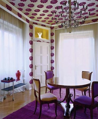
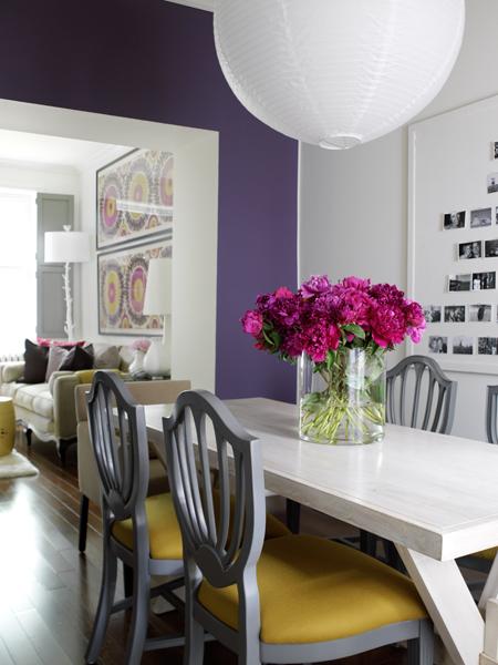
Candadian House and Home purple dining room

I don’t think I own anything purple when it comes to home decor. I only own a few purple clothing items. I like the color but it is a shade I find intimidating to work with. I don’t know why. I’ve found 2 very fun and slightly formal purple dining rooms that help me see the potential of purple.

This first dining room is from Canadian House to Home. This room is a deep, royal purple shade. It feels light and airy against the white trim and the white wall. I love the mix of white accessories, including a thrifty white paper lantern. The colors paired with this royal purple make this color workable. I love it paired with that 70’s goldenrod shade and cool purpley cement gray. And and don’t forget the temporary pop of fuchsia from the fresh flowers on the table.This room is purple room that I can see easily replicated in a “real” home. Now to the other room…

The other room I found on the blog, Roomenvy. This room is a bit more “busy” than the Canadian House and Home one. I love a bold and obnoxious wallpaper. So does the owner of this dining room. There is purple printed wallpaper on the ceiling. This isn’t that innovative, being that is a very old-fashioned thing to do. And may I add a bitch to remove. It too us forever in our dining nook to remove layers and layers of wallpaper off a small part of the ceiling. Anyways, I like this dining room because it is over the top, right down to the royal purple rug. This isn’t fitting for my home and I’m sick of seeing bold colored shaggy things. Do you remember our blue faux fur covered cabinets? Well, I do and I’ll

Patterned purple dining room

never see shag as something quirky or retro again. So, this room isn’t something that I see easily being replicated in a “real” home but it is fun to look at. I could easily see a “real” dining room incorporating this bold print on fabrics and maybe having a yellow/goldenrod painted walls.

Sorry about the lack of posts lately. I’m doing what I can to wrap up some of these projects before I go back to work. That’s keeping me very busy. And they’re boring projects too. Like cleaning, scrapping, touching up projects. These aren’t those creative projects that I crave.

-Victoria

Read Full Post »

DIY Picture Frame Shelf

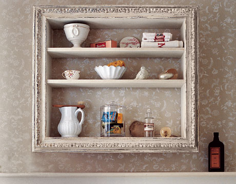
shelf from Country Living

Here’s a really cool DIY shelf from Country Living. Since I found the picture, I’ve found it on many other sites too. I’m trying to find an easy way to incorporate storage in our super small 1930’s bathroom. I like this idea.  I always find fancy picture frames at thrift and antique stores. I don’t buy them because they don’t have glass and because I have to stop hoarding picture frames. (I never use frames). I also can control the depth of the shelf. This is the issue in our small bathroom. Pre-made shelving and storage is too deep. So, now I’m on the hunt for a nice picture frame. Like always, once you are looking for it, you can’t find it. Here’s the tutorial for the shelf on Country Living’s website.

I’ve been super busy trying to finish some of the loose ends around the house. The weather has been oddly cool, rainy, and fall like. This makes me feel like I’m missing out on summer but it makes me keep busy in the house.  Saturday was our 6 year wedding anniversary and our 1 year home ownership anniversary.  So, I’m trying to make up for lost time.

-Victoria

Read Full Post »

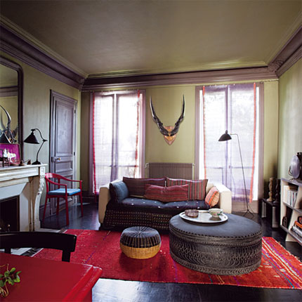
Maire Claire Maison great room

I love a foresty lichen green. Perhaps because I like fungi? Could be it, but these two rooms are tops. This first rooms is from Maire Claire Maison. It was a cool article that took an unbelievably beautiful space to begin with and gave it 3 makeovers. I like the lichen green one for many reasons. Like I said, this was a great room to begin with. It has dark wood floors in immaculate condition. The ceilings are tall and the natural lighting is breathtaking. And there are great features such as millwork, the fireplace, the door hardware. I love the lichen green walls with the milk chocolate brown trim color. This is unexpected and a bit “moody”. The red accents make the green color pop. I like the room because it has a  cozy feel. Open shelves make books accessible and the large ottoman acts as table. And I’m a fan or antlers/horns. You put those in a room and I’m in love. This room has a very “exotic” feel to it because of the color combination and the mix of objects and textiles.

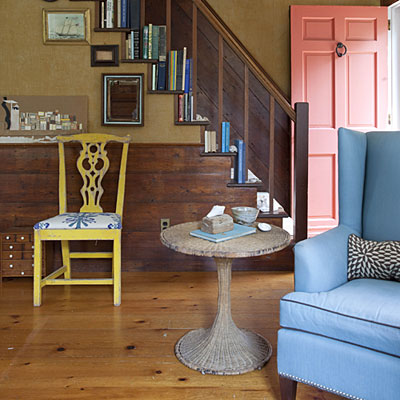
The other room, a foyer, was featured in Coastal Living. I love this room because the color combination is unexpected and I love this earthy green with wood tones. I also like this room because it is a coastal house that isn’t all light and white. I have been totally inspired by this room. I love the salmon door. I would love to see the exterior of this home. But, it looks awesome against the lichen green. I know what that color combo dominating some portion of my house. Lichen green walls and salmon painted thrift furniture or

Coastal Living lichen green foyer

salmon walls with lichen green fabrics…But, all of the colors work in here from the green to salmon to chartreuse to sky blue to sea pebble gray. I love it. Plus, the space isn’t too shabby with the all of the hardwoods. I also like steps playing bookshelf and the cool collection of pictures and how they line the stairs. And I love ship art. Especially ship art in a seaside home.

So, yeah. I’m liking lichen green rooms.

-Victoria

Read Full Post »

Last month’s (June 2010) W Magazine was awesome. It took us into the home of the reclusive fragrance genius Serge Lutens. My other blog is www.eaumg.net. Believe it or not but renovation is not my obsession. Fragrance is. I was delighted to see this article. It merged my obsession with something I’m beginning to be obsessed with, homes. My heart fluttered when I heard of this article. Serge Lutens home is so well, Serge Lutens. It’s exotic, over the top, and complex. In my little girl fragrance fantasy head, this is how I imagine this genius of a Nose living. I couldn’t believe that this is really how he lives.I’m totally intrigued and in awe of this home that took 35 years to complete. (Shoot me if I’m still trying to complete this place in 35 years). I can see why this project became an obsession. I can also understand how he wants to walk away. So much energy to complete such a project! I want to walk away after 1 year of trying to complete a project! I usually don’t like the whole “Moroccan” decor because it is a bit HGTV and I’ve seen so many bad suburban interpretations that embarrass me. But this one is breathtaking. It’s eerie. It’s perfect. Serge Lutens is a master of the senses.

Here is the complete slide show of his reclusive casbah on W Magazine’s site. I have to share this space. I rarely swoon over “celebrity” decor or house tours but this is unbelievable. It’s dreamy, verging on nightmare and that’s why I had to share.

-Victoria

Serge's garden complete with moody night-blooming flowers

Read Full Post »

House and Home birdy bedroom

I’m aware that it’s popular and it will be cliché one day, but I can’t help it. I love “bird” imagery. I love nature inspired prints and home decor. It would make sense that I would like the whimsy touch of songbirds in decorating. Here are 2 bedrooms that I’ve stumbled upon. The designers of these bedrooms love birds just as much as I do.

This first bedroom was in Canadian House and Home. It’s cute, thanks to the birds and birdcage wallpaper. I love the carefree print. I have really been craving prints lately and that is very unexpected for me. Everything in the room is “cute”. I like the pieces but together I feel they look a bit contrived. Maybe they don’t look so forced “antique” in person. Pictures are difficult like that. All of the neutral colors really let the wallpaper take center stage here. It’s a charming room.

The other room was featured on Room Envy. This room is much more colorful, but it still has the same vibe. Both rooms have beautifully printed wallpaper, white linens, and a lovely iron bed. This is a bit more “lively” version of the first bedroom shown here. I love the accents of teal. Teal is one of those colors that I

bird bedroom featured on Room Envy

have liked for such a long time. I love the mix of prints and the crisp white linens. I love the wallpaper print and would love to have that print on linens or curtains. Adorable.

Bird wallpaper in cute prints is expensive. Often retailing for about $100 a roll, so many to choose from if you type search “bird”, here. I found a nice bird print with lots of teal for $27.99 a roll here. I’ve never dealt with these companies.  I just know, that I like these prints. I’ve also learned that it pays to shop around and to “give in”. Sometimes you must have vague wants such as “blue bird wallpaper” when you’re remodeling on a budget.

Off subject…I made a plum frangipane tart yesterday and it turned out delicious! I’m really taking this cooking thing up a notch. And I purchased a rolling-pin for $5? I’ve complained for 5 years over something that is $5? Why do I not buy the kitchen items that I need? I’ve decided that if I need it then I will buy it. Having a retro kitchen has motivated me to have “retro” kitchen items such as sifters, rolling-pins, pie weights. You know those things that grandma had around but most young moderns couldn’t identify out of a line up?

-Victoria

Read Full Post »

powder blue vintage bathroom

Canadian House and Home blue bathroom

I can’t wait for our bathrooms to be finished. I’m no longer looking for design inspiration for these rooms, just looking for time and money to finish them, but I can still take the time out to appreciate nice vintage designed bathrooms. Both of the baths featured in this post have a vintage, old home feel paired with serene powder blue paint. I love an “old” feeling bathroom.

This first powder blue bathroom was featured in Canadian House and Home. This bath has a very traditional feel with the crisp white tiles and nice woodwork. I love the robin’s egg blue shade used. It looks very clean against the white. The black metal lighting and black mirror add a needed contrast to the room. The black adds elegance. It’s all very simple and it all works. I also like the vanity. I dislike bulky vanities. I don’t see the entire bathroom in this picture making it difficult to comprehend the size of the space. But, I think it is a smaller bath and I know it has lower ceilings. Look at how high the mirror is. This space appears to have a lower/normal height ceiling. I do hate the recessed lighting, but that’s me. Could this be a finished basement bathroom? I don’t know. That’s what I always think when I see recessed lighting: finished basement.

The other powder blue bath was featured in House Beautiful. It has the same feel. It’s classic and traditional and feels tranquil with light blue. It also has lovely tile floors. I love any black/white tile floors. This room is the same color combo as the 1st bath featured but reversed. Check out that subway tile. I love this look in a bathroom. This is a nice and simple bathroom too. It has all the timeless elements, nothing too trendy. The chrome fixtures work nicely. If this was my bathroom I’d have to get rid of the decoration on the toilet. I always find that weird. And the bottle beside the toilet is really strange to me. I don’t know why it is there. It makes me think of, well to put it nicely, camping or a long road trip. Really gross, sorry to mention it.

light blue and white bathroom

House Beautiful vintage feeling blue bathroom

Both baths have the same feel and the same colors. They have bright white and tranquil powder blue with black accents and a more saturated blue thrown in (waste basket in the 1st and strange toilet decor in the 2nd).These baths are simple and despite their “old” feel they seem to go with many styles. I feel that lots of money can be spent on bathroom remodeling, so try to keep it looking classic so it doesn’t feel too dated, if that makes sense 🙂

-Victoria

Read Full Post »

Marie Claire Maison dining nook

Oh, dining nooks. I love them. They are cozier than dining rooms. With just the two of us, our dining nook is the perfect size. They create such an intimate dining space.I like both of the nooks that I’ve featured in this post because they are simple, elegant, and just a little bit rustic to make it feel comfortable.

This first dining nook I found on Marie Claire Maison. It’s that classic French flea market perfection. I love the neutral colors and the rustic touches. The lighting and mirror really pop against all of the vanilla shades. I love the eclectic mix white picture frames. It really adds something to this small and simple space. I say this is a small space. Any space like this won’t appear small if paired with such high ceilings! That paired with those long loft windows make this space feel airy and open despite the light colors. Oh, and skylights. So, yeah, this is going to feel like and airy.

I wish I knew where I found this other nook. I like to give credit were credit is due. But, I don’t know where it came from, sorry. This other nook is also light and rustic. Both of the nooks I have featured have those wooden “folding” bistro chairs. It looks like I have picked them out. For some reason, I can not pick out comfortable furniture 🙂 Anyways, this room as the cutest corner built-in painted white as

"Cottage" style dining nook

well. I love it displaying white dishes. I love classic white ceramics on display. This nook is an adorable cottage or bungalow nook. I’m really attracted to it because it reminds me of our nook. I could do this look with our 30’s home.

These are two simple dining nooks with a vintage cottage style. One can’t go wrong with a clean color palette of white and neutrals. It’s a cozy look. I’ve also learned that I am not the only person in the world that doesn’t know how to chose comfortable chairs 🙂 Oh, and fresh produce on a nook table makes any space look better.

Happy Bastille Day! I hope these two rustic dining nooks have inspired you to do a little bit of summer French cooking today.

-Victoria

Read Full Post »

“Ooops” paint. Recycled paint. Mistints. We have painted over 75% of the house, 2500 square feet, in mistints. Mistints are wonderful. They are paint that is at least a 50% reduction in price. If you look enough, you will find what you need in the finish that need. That being said. It’s became a little bit of an obsession. We frequently visited all the home improvement stores in town at least bi-weekly during our painting phase. I have used mistints to paint the kitchen and studio a perfect 50’s aqua, the great room a deep gray, the dining nook a cool gray, a strange mushroomy shade for the bedroom and media room, a girly pink for the boudoir, and a boring buttery taupe for the foyers. Along the way, I have collected lots of putties, whites, and pale blues to paint furniture in. This is our Wonderful Wall of Mistints, you should see the Wonderful World of 5 Gallons in the garage.

Mistints are awesome because:

They are cheap. They are 50%-75% cheaper than retail.A gallon ranges from $5 to $10, 5 gallons from $25-$50, and the smaller sizes from $1-$2.50. Usually all brands are priced the same. This means that you could get the high-end or designer paint for $5, even the specialty metallic finishes.

They are resourceful. Mistints are really “green”. Where do you think this stuff goes if it isn’t sold? Into our landfills. Why create more waste when you have new paint already mixed? Most paint is no or low VOC these days, but this doesn’t mean that they will be environmentally friendly if we put them in landfills! This is why some trendy people like to call mistints “recycled” paints.

They are exciting. OK, this is a stretch. But, it is so much fun to find what you were looking for. It is a bit of rush. If you are thrifter then you know what I’m talking about.

They aren’t just for walls. Artists and crafters, house paint is acrylic paint. You can get a gallon of paint for $5! You can mix colors and put them in smaller bottles. Buy mistints for your art. Buy mistints to paint your flea market furniture and picture frames. You can also find stains with the “ooops” paints.

I find that our culture has a strange relationship with color. Many Americans can’t see the difference between a cool tone red or a warm tone red, but they get so picky when it comes to paint. They fret and worry about paint. It’s nuts. When I worked in the makeup biz, I learned about this strange obsession. They believed, like a prince in shining armor that offered true love, that there was only one shade that would work with their skin. Any makeup artist will tell you that it is like a Bell curve, making a minimal of 6 shades that will work under any lighting or circumstance. Paints are the same. Anyways, wasn’t I talking about home stuff and paint?  I find new mistints every time I go to the store. Many times I think the colors are wickedly ugly such as  LED light blues. Nasty.  Those mistints prove that the person getting them mixed was tasteless. But, tasteless or not, they left them. They were smacked out of their color delusion. Most of the time I find decent shades. I think these are the freaky people. The people that geek because the color doesn’t match the zig-zag stripe in their living room curtains. These are the matchy-matchy people. I am not one of these people. They terrify me.I’m the bird of prey that swoops in, picking up on their mistints and profiting from their type A personalty. I see colors in a spectrum and like cosmetic colors, colors used in decorating have some “bend” to them. There is not just one “perfect” color, but a “perfect” family of colors. But, this being said, I don’t see things as matchy-matchy and I don’t go to big ass “art” sales at the hotel to purchase “couch-sized hand-painted oil paintings”. I don’t take the Rooms to Go approach to decorating. It’s just not me.

Tips for Buying Mistints:

Start searching early. Check for mistints months before you actually start painting. This gives you more time to get what you want.

Shop for mistints in the spring-summer. I have found, at least in our area, that more mistints show up in these seasons because more people are doing home renovation projects and are most likely moving in the summer.

Have guidelines. For example, if you did not want a glossy finish and you found a perfect robin’s egg blue in a gloss but you wanted flat. Don’t buy it. You won’t be happy. Also, have some idea of what color you are looking for either be “blues” or “sorbet pales”. It makes life easier and if you have an idea of what you want, you’ll be happier. Plus, you need to buy the right paint for you space. No flats in the bathroom.

Be flexible. Have guidelines that keep you from bringing home any ole’ tub of paint, but be flexible. For example, there isn’t that big of difference between a satin or an egg-shell. Most people won’t notice that your mint is cooler than the what you had wanted. In the end when you have all of your furniture and decor in, your space will look great. Any new color or a fresh coat of paint makes a space look polished, even if it is mintier than the mint you wanted 🙂

Mix it and stir it! I have found that mistints are usually the “tricky” colors. They look like one color when they are wet and completely change when they dry. Mix them thoroughly to get the pigments evenly distributed. Be a little compulsive about it, stirring during the painting process or before you pour new paint into your tray. (Really you should do this with all paint).

Keep a color sample of the paint. If for some reason you miscalculated and need more paint, they can mix it. Keep a color sample or the can. Cans usually have bar codes on them that hold the “secrets” of the mixture.

More advice and learning by renovating: Exterior paints in the interior won’t make the place self destruct, but it takes a long time to dry. We used an exterior in the interior in the great room. It went on fine and even; it was better than most of the interior formulas. We didn’t hang pictures for about a week. Paint is paint and you can’t tell the difference. People go, “Oh, you’ll have to prime that when you want to change colors”. Yeah, I will. From my experience you have to prime everything, especially a dark liver gray on lath and plaster walls. Today’s paints require and expect that you’ll prime.

-Victoria

Read Full Post »
Black and white striped bedroom

I love black and white stripes. I prefer things that are high contrast and you can’t get much more contrast than black and white stripes. Here are two bedrooms that I’ve stumbled upon featuring a simple color palette of black and white, but it has been jazzed up with stripes. And these rooms have a traditional, classic feel to them.

I wish I knew where this 1st room came from. This bedroom is amazing and I’d love to take a tour of the entire house. This room is traditional. The furniture is immaculate and the pictures are interesting.  The striped wallpaper only makes it better. I’ve considered painting stripes on our walls. However, we have knock down lathe and plaster and it would look stupid. And I don’t have the patience for it. Wallpaper would be nice, but do I have the patience for that either? And our walls are in great shape for 30’s lath and plaster, especially considering its been through some earthquakes. I shouldn’t cover it up. How quickly I forget the process of wallpaper removal!

Looking for bold black and white striped wallpaper? I wish I was. Lots of sites have this type of paper; it’s popular. So popular that The Home Depot carries it for about $35 a bolt.  Don’t read their write up. It’s so lame. You would think that wallpaper was only a product for the young moderns. It actually says, “Today wallpaper is the hip, new approach to

striped bed

Canadian House and Home bedroom

cover your walls”. OK, maybe read it.

This other room is something that I could do. It’s a super neutral color palette of black and white. Of course it always helps to have awesome architectural details in any living space. This room has great bones. It is from Canadian House and Home. This room incorporates the visual pleasure of stripes with linens. OK, so I can’t get this plantation like room in my house because I don’t have shutters, custom windows, or that ceiling. But, I can buy a striped duvet. I like black and white stripes because they appear to be a more sophisticated alternative to zebra print. And they are so Dorothy Draper glam.

Looking for black and white striped bedding? I’m having a difficult time finding black and white striped bedding that I like, especially for a deal.  It’s all too contemporary or “junior”. It seems so Swedish farm house style that I thought Ikea would have something. They have the fabric but no duvets. Dwell Studio has the “Draper” (told you so). It’s nice but not exactly what I’m looking for…sometimes things just aren’t black and white 🙂

-Victoria

Read Full Post »

I’ve craved quirky and bold color combos lately. I blame it on summer. Summer makes me go for crazy colors. That’s what got our home in the mess that is in 🙂 I chose the colors during the hottest month in the PNW. We ended up with overly energetic/obnoxious colors. I spent most of the winter months hating them/criticizing my design choices and now I love them. My house would be fluorescent/day-glo if I lived in a warmer and sunnier place.

Colorful room with pink floors

I have found these two rooms on-line. I love them. They are wild and unexpected but still classy. They don’t look “dormy”! This first room is bold. I can’t remember where it came from. I wish I knew because I would love to explore the entire house. You don’t get any bolder than paining your floors hot pink. And you definitely don’t get any bolder than painting your floors hot pink and your trim yellow and your walls with polka dots. I’m in love with this space. It’s so bold that even I don’t know if we have the guts to “go there”.  This is my dream interior for a New Orleans row-house or a Caribbean mansion. I love the insane-o colors mixed with the dark woods (mega-contrast). The “accessories” are so classy but unexpected with the colors. I mean wouldn’t that chair with the pink upholstery be bold in any room? In this space, it is looking very tame. And don’t you love those chintzy rose curtains? It adds a needed shabbiness.

This other room is a bedroom found at Marie Claire Maison. This is another fun, quirky space with lots of hot pink. It’s much less bold than the room featured above being that the floors aren’t Barbie pink and the walls are a neutral color. This Marie Claire room is all about the accessories. They transform the space. I think this an adorable room for little girls and big girls. My weakness is bold painted trim. It’s easier to do than what people think and it

Marie Claire Maison quirky pink bedroom

totally changes a space. I wish we did the trim crazy throughout our house. I did one room but I wish I did the entire house. I need pink trim throughout the house 🙂 This room has so many quirky accessories and textiles. This room is all about the “treasures”. These treasures add whimsy to the room. They are cute but they sure are creepy. That’s my favorite genre for home decor. I love this bedroom because it seems so livable. It isn’t a huge room. This seems like a room that regular-ole folk could get even though I know that some of those accessories are pretty darn pricey. *Note that creepy baby doll in the glass dome! But, I like this room because it can be transformed by switching textiles. You can also hide stuff under the bed and nobody would know. The shelf is a nice touch but I don’t think I can sleep like that. I’d be so paranoid that my $175 tray and all that glassware would come tumbling down on my face while I sleep. I do live in an earthquake zone, so that is a bad idea.

So, yeah, I hope that these rooms have inspired you just as much as they have me. I now know that there is no such thing as too bold. Just look at these 2 rooms!

-Victoria

Read Full Post »

Older Posts »