Feeds:
Posts
Comments

Posts Tagged ‘dining room’

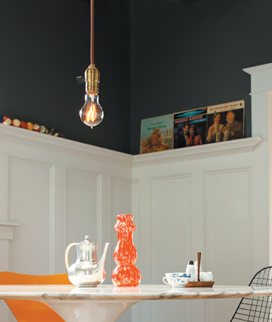
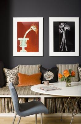
Blue & orange. If you know a thing or two about the color wheel then you know the BAM! that this complementary color scheme has to offer. Blue and orange are definitely a color trend now in film, video, media. Think CSI Miami! Anyways, here are 2 young but not juvenile dining spaces with deep navy walls the perfect accents of orange. This rooms also have something else in common: records! Being a vinyl hoarder, I love to see records used in design.

Celerie Kemble dining nook

The first room is from designer Celerie Kemble’s portfolio. This is a cool space. It’s a little more modern than what I do, but it has vintage. OK, so the room isn’t “navy” but it is a bit of squid ink paint shade, so there is some blue in that gray. This gray appears more “blue” with the touches of orange. I love dark gray walls. It is a bit of a “modern” shade and it can come across as very masculine, but it packs drama. You want to transform a room in a weekend, paint it this color. Everything you own will look completely different. Whites will pop and blacks will shine. Anyways, I love the record storage in this nook! It is so clever to have it under the seating in a small space. I got to tell David. He need to build us one of these.  Anyways, this is a cozy space, very hip. I want to listen to records and lounge around drinking beer and eating guacamole and chips in this nook. *Oh, I love the textiles in here because it keeps this color combo and space from being too masculine. It’s a nice balance.

The other dining room or nook is from Rejuvenation’s website. It is a really cool space as well and totally reminds me of the early 1910-1940’s Craftsman homes in the Seattle area being fixed up by young adults like ourselves. (Rejuvenation is based in the PNW). This dining room is the kind of dining room you’d see in our neighborhood while your taking the dog out for an evening stroll. It’s classic but it has a special type of vintage lust seen in the under 40 crowd. I guess what I’m saying is that I love the look of vintage mid-modern pieces shoved into a Craftsman. The cool thing about this space is that you remove the furniture and the accessories and you have a classic Craftsman home that appeals to everyone. You didn’t do anything to ruin the vibe or the bones of the house. You worked with the house and added your tastes without destroying the authenticity of the home. I’m all about that.

Rejuvenation dining room

Anyways, I love this room. Once again, it is a “squid ink” shade that looks awesome against that white mill work. The orange accents are brilliant in this room. The lighting isn’t very typical of old homes but it has a nice vibe, a young vibe. I love the records on the ledge (recognize a few from our own collection). And one can never go wrong with a Saarinen table.

I guess we are going to try to finish the upstairs bathroom this weekend. I have to admit that I’d rather do something else, you know, like something fun. Oh, well. This house isn’t going to renovate itself. Bummer.

-Victoria
Read Full Post »

Marie Claire Maison dining nook

Oh, dining nooks. I love them. They are cozier than dining rooms. With just the two of us, our dining nook is the perfect size. They create such an intimate dining space.I like both of the nooks that I’ve featured in this post because they are simple, elegant, and just a little bit rustic to make it feel comfortable.

This first dining nook I found on Marie Claire Maison. It’s that classic French flea market perfection. I love the neutral colors and the rustic touches. The lighting and mirror really pop against all of the vanilla shades. I love the eclectic mix white picture frames. It really adds something to this small and simple space. I say this is a small space. Any space like this won’t appear small if paired with such high ceilings! That paired with those long loft windows make this space feel airy and open despite the light colors. Oh, and skylights. So, yeah, this is going to feel like and airy.

I wish I knew where I found this other nook. I like to give credit were credit is due. But, I don’t know where it came from, sorry. This other nook is also light and rustic. Both of the nooks I have featured have those wooden “folding” bistro chairs. It looks like I have picked them out. For some reason, I can not pick out comfortable furniture 🙂 Anyways, this room as the cutest corner built-in painted white as

"Cottage" style dining nook

well. I love it displaying white dishes. I love classic white ceramics on display. This nook is an adorable cottage or bungalow nook. I’m really attracted to it because it reminds me of our nook. I could do this look with our 30’s home.

These are two simple dining nooks with a vintage cottage style. One can’t go wrong with a clean color palette of white and neutrals. It’s a cozy look. I’ve also learned that I am not the only person in the world that doesn’t know how to chose comfortable chairs 🙂 Oh, and fresh produce on a nook table makes any space look better.

Happy Bastille Day! I hope these two rustic dining nooks have inspired you to do a little bit of summer French cooking today.

-Victoria

Read Full Post »

Happy Valentine’s day!

I am very happy that the dining nook is 90% finished. We still need to finish one side of the room with shoe molding and to put one of the built-in’s doors on. David says we don’t have hinges, umm, buy some. So, I’m closer to living like a normal person.

A few weeks ago my Martha Stewart wannabe self went out and purchased stuff for our Valentine’s place setting after seeing this setting from marthastewart.com. I love aqua and red together. It is such a retro color combo, very 50’s diner in my mind. I headed out to Target, purchased adorable Greek key printed aqua melamine plates and red melamine bowls (on sale for under $1 a piece). I paired these with my French pink table runner and antique white hobnail milk glasses and vase and candle sticks, and red heart demitasse set. I’m quite the party planner now 🙂 However, I am lacking with the napkins and napkin rings. I never got around to that. I was too busy doing other important things around the house like getting my bathroom in working order and cleaning up plaster dust.

For those of you up to your eyeballs in home renovations, I just want you to know that a table setting may seem like the most useless thing to be putting energy into, but it did make me feel a bit more sane. It made me forget that most of my house is a construction zone. The aqua and red combo districts my eyes from the unfinished portions in the dining nook. I should be gazing into my hubby’s eyes anyways 🙂

-Victoria

Read Full Post »

I have learned recently that there is not a color out there that people hate more than pink. I personally love pink and I enjoy it in decorating. I have been shocked by other people’s reactions of pink. For example, I have painted my super tiny “boudoir” pink with a khaki trim. People look in and go “Did you mean to do that?” or “Wow, I assume that you haven’t gotten to this room yet.” That was one of the first spaces I worked on and yes, I meant to do that. I have witnessed people’s faces cringe at my choice of pink. I find their reaction entertaining and very odd. After thinking about this much too long, I have came to the conclusion that people are either A. very boring and narrow-minded. They can’t think of pink for anything other than a pretty-pretty princess little girl’s room. They aren’t willing to detach pink from prissy pig-tailed little girls and see it as an unexpected color to use and B. people hate women. They hate things that are associated with femininity. Men think being in a pink room shrinks their balls and women think that they are weak if they like pink. They think it means if they say they like it then all of female kind will go back to being a stay-at-home baby factory that was lucky to get a high school diploma. OK, so maybe both A and B are very harsh, but I do think that people have some very set stereotypes and “hang-ups” with pink.

I like pink. I feel I can embrace it. I can embrace it as a bright and unexpected color to use. So far, I have been very happy about my pink choices. I have found these two pink dining rooms. I like them. But, somebody should let them know that they will never resell the place if they keep the colors this way. If you are going into foreclosure or something like that or if you really don’t want your house to sell, then paint your rooms pink. People can’t get past it!

Betsey Johnson's dining room

This first dining room is nice. It’s Betsey Johnson’s dining room, so yeah, it’s pink. I’m sure that I feel in love with it because of the sputnik lamp. I think I like any room with one. This room is very pink. It has a formal and somewhat 60’s vibe. I like this room but I do feel the pink is overwhelming and it should of been balanced out with more chartreuse and maybe more “gold” metals. It’s a whimsy room. And I love it with the “dark” lines of the table and mirror. Ohh, I need a sputnik for our dining room.

I think this other room came from Cottage Living magazine (another RIP magazine). Once again it is a room with pink, acid green, and dark contrasts. It is fun and I think this home is in California. A place with lots of sunshine can pull off these colors easily. Pink really looks great with wood tones.

I don’t really think that either of these dining rooms are “timeless” but I do think they are fun. You could keep all the furniture, linens, and accessories and change the color of the walls and get an entire new room. That is the power of pink. It’s just one of “those” colors. It can change an entire space. That being said, taking it away can change an entire space as well. I’m with my pink right now.

Cottage Living dining room

I have to ground it with neutral colors, woods, and creepy objects for a grown-up look. My husband doesn’t mind all the pink either. That’s good. I did marry a guy that enjoys interior design and decorating, so I would actually be shocked if he didn’t like pink. Or perhaps he’s learned that marriage is more important than complaining about pink. I’m fine with either reason.

-Victoria

Read Full Post »

Powder blue paint is not going to work with my house in its current state. We have too much Fender Strat aqua elsewhere. I do love powder blue because it is soft, light and it’s a bit conservative but still fun. It works with any style. These are 2 dining rooms that I like. I haven’t worked on our dining room in a very long time. It still has wallpaper patches. I’m trying to get motivated here.

Domino (RIP) dining room

Domino (RIP) dining room

This first one is from Domino. It’s formal but a bit fun. The powder blue looks so sophisticated and fresh. It works so nicely with that pure, true white trim. Of course that trim would work with anything; it’s wonderful. I like this dining room because it has a bit of that “French” style with attainable accessories. That crystal ship light fixture is available at Z Gallerie. It goes for under $800 and really adds so much to the room. You can find a table very similar to this at a junk store and paint it white and distress it. You could do the same with the chairs and you could use a metallic finish paint to fake a galvanized look. Portraits like that are available on Jayson Home & Garden website for under $1000. I’m sure you could go antiquing and find something you like for cheaper. I love the hobnail glasswear.All of these things can be found but it does take time. I don’t have enough of that. Since we are in this new house, we have no furniture that works. I know exactly what I want and since I refuse to purcahse anything not well made, it will take some time. Until then, we are living out of boxes and sitting on painfully uncomfortable chairs that I have refinished.

This other dining room is courtesy of Martha Stewart. I am in love with most of the colors that she uses.

Martha Stewart dining room

Martha Stewart dining room

You can take any color and mix it with some rustic, rugged wood and I’m pleased. Oh, and brass doesn’t hurt. I want that light fixture badly. This is another powder blue room with amazing millwork and large, light plank wood floors. This color appears so light and airy with the pairing of bleached out wood, crisp white, and taupes. But, I feel it could also look amazing paired with darker woods and fabrics.

I do love this color. I used to be scared of it because I thought it was too childish. Obviously this is not so. It is very regal, formal, and classy.

-Victoria

Read Full Post »

It is almost my favorite time of the year: full fledge fall. I have always loved autumn because of fall fashions (love layering), falling leaves, the smell of decay, cooler weather, pumpkin spiced lattes, and mushrooms. David and I are mushroom hunters. This keeps us outside when the weather is less than perfect. It’s actually fun to be out in the misty rain with decaying leaves just to spot their strange shapes, odors, and colors. We eat what we know is safe, very obvious ones, but mainly I just love mushrooms for their strangeness. (And when I say we hunt mushrooms, I must add that we are all about the non-psychotropic types). It is almost prime mushroom time here in the forests of Washington. We went out today and saw a few. It was nice to see after the dryness and hotness of our freakish summer. Since we are mushroom fans, we are always happy to spot mushroom decor. I’m always on the “hunt” for mushroom home items. I love this toad stool found at Velocity. It’s a bit costly at $297 and many local artists in the PNW can create one of these for much cheaper. But, anyways, I love these but I didn’t know how to use it without looking too cheesy, nerdy, hobit-ish or make it work with what I like. I found this Parisian apartment online and fell in love with it. It is very whimsy, but still classic and functional and totally what I am in to.

Parisian apartment

Parisian apartment

It is a very inspiring room for the fungi fanatic. Every detail is so interesting. It’s classy and a bit unexpected. This is how I want our house to be. A bit stuffy but with a sense of humor. I love the beach pebble lilac grey walls of the sitting room/dining room area against the contrast of the pickle green wallpaper. (I must add I adore the dog paintings, wouldn’t it be cool to have Gig paintings over a formal sofa like that?) I feel this space is so charming and functional. Plus, it doesn’t hurt to have a location in Paris, amazing woodwork, perfect hardwood floors, and towering ceilings.

It’s nice to think about decorating again and not the boring stuff of a renovation such as peeling wallpaper, popping staples, demolishing walls, and restoring hardware.

-Victoria

Read Full Post »

Thomas Paul Gothic Dessert Plates

Thomas Paul Gothic Dessert Plates

I have said for quite sometime that a raven and its imagery should be used more and more in home design. This being said I do some of my home shopping around Halloween so I can pick up some of these images. And Halloween products are already out, soon don’t you think? I really like these Thomas Paul Gothic Dessert Plates, um, not a Halloween product. (It is going to be a long time before I host a dinner party but I would love to have these). You can get the set for $28 from Velocity Art & Design. I like them all, I guess, but I would really be happy if I got 4 raven plates. These are made out of melamine (is that gothic?) so they are dishwasher safe (as always since I am the dishwasher) but not microwave safe.

Read Full Post »

First impression: awesome wallpaper.

First impression: awesome wallpaper.

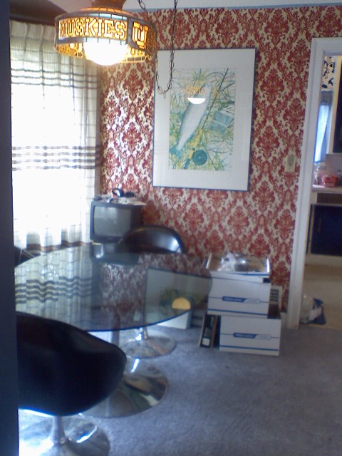
When this house was for sale, I peeped through the windows before being showed the home “formally”. Glad I didn’t get accused of being a Peeping Tom. I was peeping but not for those perverted reasons. Trust me, nothing to see here but junk and not that kind of junk. Geez. The windows through the back were open and I was amazed at what I saw. It was the most amazing red and gold wallpaper ever in a small dining nook. I just knew that I had to see more and boy did I see more.

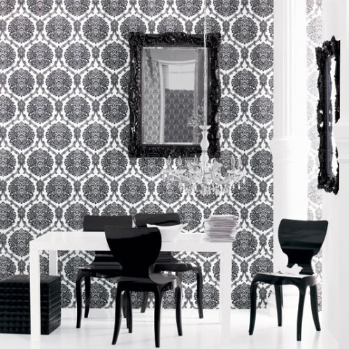
I love wallpaper and this stuff is tops. It is felt and foil and completely fabulous. Unfortunately, it is grotty (filthy, peeling, felt rubbed off in areas) and it has to go. New windows are being put in and some electrical stuff needs to be done. It’s sad because I would love to work with this stuff, but dirty is dirty and repairs must be made. I hope to salvage and frame some of it. The print is just too good to disappear. I did find the exact same stuff online, Rosie’s Vintage Wallpaper (awesome site BTW), but for  $325 a roll! I would of splurged but a roll won’t do the space and the ceilings are tall and coved. It’s hard to “draw a line” of when to quit. I just thought it would be cool to be able to keep that bold print in such a small space. Heck, Brocade Home (pictured below) does this all the time and people love it. Brocade has tacky light fixtures as well but I don’t think any are as tacky as a Tiffany styled swag Huskies lamp. The carpet is going too. Can’t wait to see the wood floors beneath!

Everybody is doing it!

Everybody is doing it!

After looking for vintage wallpaper online, I came across some pretty groovy stuff at a thrift store for like a $2 a roll, some very Buck Rogers stuff. It’s foil, no felt. It’s a mod in a 70’s way design with silver, white, macaroni n’cheese orange, and yellow. I don’t know if or where I’ll use it but I do have a bit of a wallpaper bug right now. Perhaps in the speech studio?

-Victoria

Read Full Post »

It’s funny because I have found that I have many style twins. It’s purely accidental. I sometimes wonder if it is a sign of a mental illness and if the updated DSM-IV includes check off boxes that I am unaware of such as “strange desire for all things animal print”, “love of pets in clothing”, “inability to accept Ugg boots and short denim skirts as appropriate attire”, and “love of anything creepy and old”. Because of the internet I am know aware of my style twins, especially with clothing. It’s made the world a smaller place. I find that I have more in common with people than I thought I did. Anyways, I have a subscription to Sunset magazine and earlier this year (2009) they ran a piece on designer Sheri Sheridan’s home. I had to laugh out loud and share the article with hubby. Here was another style twin or at least we were shopping at the same place (thrift stores, antique stores, and Z Gallerie)! My husband laughed because she had a sunnier more Californian version of our dreary Northwestern bungalow. Same accessories just different colors.

Sheridan's living room

Sheridan's living room

I of course clipped this article from the magazine to put in my “style book”/inspiration book. Her living room definitely reminds me of ours. We have the same couch but with zebra print pillows. We have a furry rug which matches her furry pillow. I have the same  Z Gallerie ram’s head, one of my favorite finds ever. (In fact, everything that I have ever purchased from Z Gallerie she has in her home). Put a Frenchie in place of that dalmatian and you’ve got my home with my future pup.

The article has most of her home pictured. She has some bold colors. I am not wild about the blues because they aren’t minty enough and she has a yellow room and I don’t do yellow. It will take me some time to get used to that since I grew up in a home with yellow interior. And she isn’t in Washington. I don’t think those colors make sense here but I see them really working in California. But, throughout the home she has great knick-knacks and furniture.

One of my favorite rooms is the dining room. This is kind of how I plan on doing our dining room in the new house. I love the Saarinen table, this will be one of our first investments but I think I would settle for a knock-off even though I hate Ikea. I plan on doing the mismatched chairs as well just because I love refinishing chairs. I love the gray walls and I’ve already purchased a mistint in the perfect shade of grey. We plan on splurging on a Sputnik lamp/chandelier, a small one. Our dining nook is small and I want it to be elegant shades of white and grey. I’m still searching for a cute tea cart. There is a built-in corner cabinet with leaded glass. However, it has been coated with faux wood contact paper inside. Ughh, I hope that is easy to get rid of. I wanted to paint the inside of the built-in a color to make my favorite black and white knick-knacks pop, but I still don’t know what shade. Any suggestions? It will definitely be a mistint.

Sheridan's dining area

Sheridan's dining area

You can see the entire article here. I love it because she has some great finds, many affordable tips, and she paints her home in mistints. Love it, it’s classy and on a budget. It’s the kind of home you see in a magazine and go “that can actually work for me” or “hey, another style twin”.

-Victoria

Read Full Post »

I find myself spending more and more time searching for “rooms” online than I do fragrances/cosmetics. Oh, how I’ve grown! Today, I’ve found two rooms that are heavy on teal and chartreuse and I like them. anthropologiejade

The first is a room courtesy of Anthropologie. It is an elegant use of all of those thrift store decorations we have around. I am completely aware that this is a staged room and that it has never had to be functional. It only exists to sell expensive things upholstered in bold me-maw-ish fabrics. But, I do like the color combo. The walls are rich, a peacock blue, that I would of never chosen. It looks a lot like Benny Moore Jade Garden or North Sea Green. It looks great with the pops of chartreuse. Blue and green are the only colors used and I like it. This room is very cozy but doesn’t look like a bunch of tea roses threw up in your shabby chic cottage. I like the mix of prints. They are bold, really 70’s and if I saw this room when I was 16 and wearing polyester burnt orange plaid pants and thrift store tees, it would of been my dream room. I appreciate this room for its cool color scheme but I do find it a bit matchy-matchy and I won’t be trying to recreate it. But, I might “borrow” from it.

The second room is a Jonathan Adler dining room. I like this because it is bold and graphic yet still simple. This I could live with. It has a lot ofadlerdiningroom color only because of the bright furniture and curtains. (I must add that I am not a curtain person. My granny is a curtain addict and I have to say that her obsession has forever made me stay away from them). This room is matchy-matchy too, the curtains match the vase. (Personally, I’d rather see an orange vase or even a black vase, but hey, I never find a room that is perfect. I mean don’t get me started on the glass top dining table) I love the black doors. The home we are getting does have doors that are painted black, but they are in the “porno” room. Who knows, maybe I’ll keep them black. Anyways, I am attracted to this room just because of the teal and green. It’s young but it still looks formal. I think I really like a bold “in yo face” contrast. I’m trying to out grow that but I can’t. I’ve got to take this one step at a time. I mean I only outgrew Claire’s with all of their pink plastic heart hair accessories  like 1.5 years ago and I should of cut that tie at least 5 years ago. These things will take time. I’m a growing gal and all. Look at me, buying a house and all but I still have to have some fun. So, now to counteract all this grown-up house stuff, I’m going to go beautyhabit.com and fall in love with all the new releases and be frivolous and stuff.

-Victoria

Read Full Post »