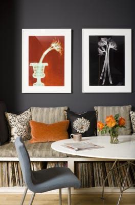
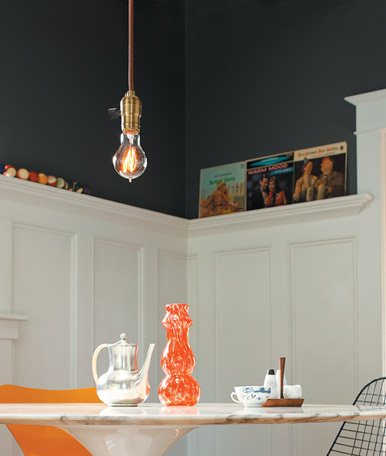
Blue & orange. If you know a thing or two about the color wheel then you know the BAM! that this complementary color scheme has to offer. Blue and orange are definitely a color trend now in film, video, media. Think CSI Miami! Anyways, here are 2 young but not juvenile dining spaces with deep navy walls the perfect accents of orange. This rooms also have something else in common: records! Being a vinyl hoarder, I love to see records used in design.
The first room is from designer Celerie Kemble’s portfolio. This is a cool space. It’s a little more modern than what I do, but it has vintage. OK, so the room isn’t “navy” but it is a bit of squid ink paint shade, so there is some blue in that gray. This gray appears more “blue” with the touches of orange. I love dark gray walls. It is a bit of a “modern” shade and it can come across as very masculine, but it packs drama. You want to transform a room in a weekend, paint it this color. Everything you own will look completely different. Whites will pop and blacks will shine. Anyways, I love the record storage in this nook! It is so clever to have it under the seating in a small space. I got to tell David. He need to build us one of these. Anyways, this is a cozy space, very hip. I want to listen to records and lounge around drinking beer and eating guacamole and chips in this nook. *Oh, I love the textiles in here because it keeps this color combo and space from being too masculine. It’s a nice balance.
The other dining room or nook is from Rejuvenation’s website. It is a really cool space as well and totally reminds me of the early 1910-1940’s Craftsman homes in the Seattle area being fixed up by young adults like ourselves. (Rejuvenation is based in the PNW). This dining room is the kind of dining room you’d see in our neighborhood while your taking the dog out for an evening stroll. It’s classic but it has a special type of vintage lust seen in the under 40 crowd. I guess what I’m saying is that I love the look of vintage mid-modern pieces shoved into a Craftsman. The cool thing about this space is that you remove the furniture and the accessories and you have a classic Craftsman home that appeals to everyone. You didn’t do anything to ruin the vibe or the bones of the house. You worked with the house and added your tastes without destroying the authenticity of the home. I’m all about that.
Anyways, I love this room. Once again, it is a “squid ink” shade that looks awesome against that white mill work. The orange accents are brilliant in this room. The lighting isn’t very typical of old homes but it has a nice vibe, a young vibe. I love the records on the ledge (recognize a few from our own collection). And one can never go wrong with a Saarinen table.
I guess we are going to try to finish the upstairs bathroom this weekend. I have to admit that I’d rather do something else, you know, like something fun. Oh, well. This house isn’t going to renovate itself. Bummer.
-Victoria


