Feeds:
Posts
Comments

Posts Tagged ‘living room’

Maire Claire Maison great room

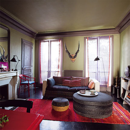
I love a foresty lichen green. Perhaps because I like fungi? Could be it, but these two rooms are tops. This first rooms is from Maire Claire Maison. It was a cool article that took an unbelievably beautiful space to begin with and gave it 3 makeovers. I like the lichen green one for many reasons. Like I said, this was a great room to begin with. It has dark wood floors in immaculate condition. The ceilings are tall and the natural lighting is breathtaking. And there are great features such as millwork, the fireplace, the door hardware. I love the lichen green walls with the milk chocolate brown trim color. This is unexpected and a bit “moody”. The red accents make the green color pop. I like the room because it has a  cozy feel. Open shelves make books accessible and the large ottoman acts as table. And I’m a fan or antlers/horns. You put those in a room and I’m in love. This room has a very “exotic” feel to it because of the color combination and the mix of objects and textiles.

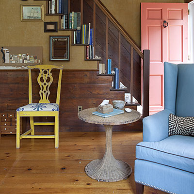
The other room, a foyer, was featured in Coastal Living. I love this room because the color combination is unexpected and I love this earthy green with wood tones. I also like this room because it is a coastal house that isn’t all light and white. I have been totally inspired by this room. I love the salmon door. I would love to see the exterior of this home. But, it looks awesome against the lichen green. I know what that color combo dominating some portion of my house. Lichen green walls and salmon painted thrift furniture or

Coastal Living lichen green foyer

salmon walls with lichen green fabrics…But, all of the colors work in here from the green to salmon to chartreuse to sky blue to sea pebble gray. I love it. Plus, the space isn’t too shabby with the all of the hardwoods. I also like steps playing bookshelf and the cool collection of pictures and how they line the stairs. And I love ship art. Especially ship art in a seaside home.

So, yeah. I’m liking lichen green rooms.

-Victoria

Read Full Post »

For the first time ever, David and I have too much bookshelf in our life. After making a cross country move, we purged and donated lots of books and records. This house has 4 built-in bookshelves in the great room. I don’t know what to do with them because I’ve never had this much space to work with. I’ve collected pictures on-line to inspire me with bookshelves. I’ve figured out what I like about the ones in the magazines but I can’t achieve that in my home.

All the magazine ready bookshelves have these things in common:

-All the books are to the same scale. They are displayed by size. Most of their books are large. It appears that nobody in the magazines have City Lights Pocket Poets Series.

-Never do I see paperbacks! And most of the books appear to be for decoration. For example, they all look antique or old. They are like staged books.

-Cool things are incorporated in the shelves. These cool things, either pictures or knickknacks, all have a common theme. This theme can be white glassware or black & white pictures, you get it. It doesn’t feel so random.

– Sometimes books are grouped by color. I don’t know if I like this.

Tudorks bookshelf

A glimpse at one of our built-in bookshelves.

Here’s my problem:

– My books are all over the place in scale. I have giant hardbacks and teeny tiny City Lights Pocket Poets Series.

– I have paperbacks and books that look new.Many of the books have obnoxious, bright spines.

– I have too many cool things and they are all over the place in theme. I can easily choose a theme but it may take years to get that “look”. I want my theme to be old stuff that I like. Creepy, old stuff, almost like an apothecary. And pictures in black frames. I also want tabletop antique radios on the top of the shelves.

-I may have too much shelf. See this pic above and below. I have 4 of those from floor to almost the ceiling. Because of they are so spacious, they’ve been a catch all for all our random stuff. You see that shelf: antique lighting shades, antlers, 1930’s Guerlain, apothecary jars filled with exotic resins, and pictures of random people with bags of moneys. This has been were we put our stuff to keep it out of the way of the renovation. The bottom ones with the doors have been great storage.

Tudorks Bookshelf

A view of the entire bookshelf, now, add 3 more.

Our great room/living room is a disaster. This room has the most potential but we intimidated by the large space. Also, our furniture doesn’t fit and it will take time to save up to replace it all. Because this room is so useless and ugly, we never go in there. We never use it. I thought the easiest (and cheapest) thing to tackle at this stage would be the bookshelves.

Now what should I do? I’ve been thinking about getting rid of most of the books. I know this doesn’t fly with some people but I would love to go paperless except for antiques. If I can get it on a Kindle, then I should get rid of it. If I want a book, that’s what the library is for. Do I ever go  to that bookshelf and take a book off to read it? No. The only ones that I look at are the antique ones. How do I make my “theme” look intentional during the collection stage? Right now I feel it is all so random, because it is. I don’t want my bookshelves to look like me-maw’s curio cabinet of Swaroski knickknacks and Home Shopping Network collectibles. How can I make these shelves functional? Any ideas?

H.G. Lewis autograph

Had to share our H.G. Lewis autograph

I have to share our Herschell Gordon Lewis autograph. This was one of those too cool things we had boxed away. Who doesn’t want the autograph of the man that started “splatter film” and junk mail. What great contributions to our society!

So, yeah, here’s a peek at one of our many messes. I’m open to suggestions. I feel this is something that I can tackle and maybe this will motivate me to get the great room together. The room isn’t finished. We need a mantel and a sofa that is better scaled for the space. But, the bookshelves just need TLC and editing.

-Victoria

Read Full Post »
Mary Greetis living room

I am attracted to a Hollywood Regency style. I like for things to be over the top and costumey. Here are two living rooms that I have stumbled across that I like. The first room is a Mary Greetis living room. It’s pretty stark and really benefits from the pops of red orange. It isn’t very Hollywood Regency but it is quirky and fun thanks to the Jonathan Adler lamps. We have 2 picture windows in our great room this size and it is nice to see how others decorate with such a ridiculous aquarium windows.

The other room is from somewhere. I can’t remember. It is just a close-up of a mantel but I do like quirkiness of it all. It’s a good use of symmetry. The red really pops in this space as well. And I need to find a use for all of the silly 60’s-70’s Baroque style picture frames and mirrors that I have collected from thrift stores and spray painted over the years. I think that this display is a nice use of somebody’s collection.

I think this last room fits more of the Regency style. It’s symmetrical.

These rooms aren’t OTT Hollywood Regency but they do have a retro Regency “don’t take yourself too seriously” vibe.

-Victoria

Read Full Post »

Our great room lighting

I am aware that I complain about lighting frequently. I rarely find things that I like and if I do, it is expensive. I do feel that lighting is a nice investment since it adds so much character to your home. It may not make you money in the long run since it is such a taste game but it really does tie your look together. I can’t afford to purchase all of my dream lighting at once. Or maybe ever… The great room was difficult for us. We want a formal room, something creepy and stuffy. We also wanted to purchase antique period lighting but I couldn’t’ find anything to suit the home. The lighting was either too large for our 30’s suburban home or just too craftsman. Nothing seemed to fit our home’s personality. And I’m not paying $800+ for something that isn’t perfect. The room’s lighting was replaced by the previous owner with the ugliest and cheapest “spot” lighting ever. We had to get rid of it, quick. It was disgusting and only one light bulb worked. I wanted something nautical or octopus like, I can’t afford a Walacavage at this time. While rummaging through our Habitat for Humanity’s building salvage yard, I found this lighting. At 1st, hubby wasn’t having it. He thought it appeared too “normal” and “McMansion” or trying too freak’n hard to be affluent. I told him he had to trust me. And if he didn’t like it, we were only going to lose $8. I purchased globe vanity bulbs to make it look less traditional and to make it look more 60’s and octopus-ish. David put it up and really liked it. It goes well with our dark, cave-like room. And with bulbs and all, it was under $18.

-Victoria

Read Full Post »

I used to think that dark rooms only existed because they photograph well. I thought that “real” people didn’t have dark rooms because they didn’t look good in “real” life. I’ve painted a few rooms in our home dark. They look just as good in my working home as they do in pictures. Dark colors have so much impact and drama. This is why I’m attracted to the two featured here.

Design Sponge living room

This first room was featured on Design Sponge. I love the slap in the face of hot pink. It is stunning. Not much more to say. This is about the color of our living room, or at least the color that it appears in pictures. We have a bust of Napoleon painted that shade of pink on the built-ins. Napoleon really adds something. I am all about contrast anyways. That’s why I like black and white floors, zebra prints, and wild trim colors.

Anyways, I love this room. The colors are amazing. It is sophisticated but still very “young” feeling without being too perky. It has a certain moodiness. Oh, and great lighting too. The thing about dark rooms is that you need many, many different light sources: overhead lighting, windows, floor lamps, table lamps, sconces, candles, anything that gives off light. Different light sources transform the room and makes so many different “moods”. This room also uses texture nicely. You have a glossy hot pink coffee table, painted floors with a sheen, fuzzy maize throw pillow, mysterious silky purple throw pillows, and matte walls. It all works so nicely together and adds so much interest.

The other living room was featured in Homes and Gardens. It has the same feel of the Design Sponge room. It’s dark with these shocking bold colors and diverse textures. I assume that this room is hand painted but it may be wallpaper.

Homes and Garden living room

I don’t recall. This room is all about the walls. Of of the colors are taken from the design on the walls. I love chocolate brown and chartreuse together. The fuchsia adds so much too. The textures are so luxurious but the colors are a bit unexpected. Somehow this room has crushed purple velvet chairs but it doesn’t look like a blaxploitation pimp decorated the room . (Actually the room would probably be much more fabulous if it was decorated by a pimp character actor). Anyways, I love this room because it takes so many “me-maw” elements such as throw pillows, “wallpaper”, glassware, “slipcover” upholstery, and this formal living room still looks “young”.

These dark rooms do have something else in common: they are both large with tall ceilings. I think this is another reason why these rooms don’t feel claustrophobic.

-Victoria

Read Full Post »

Bold blues aren’t colors that I am attracted to for my own living space. I prefer aquas, teals, cyan. I find bold blues hard to work with but I do appreciate them except when they include a black silhouette of a nude past girlfriend, oh, my house. Or what used to be of this house.

House Beautiful bedroom

House Beautiful bedroom

Here are 2 azure rooms that I do appreciate.

The first is a fun bedroom found in House Beautiful. I love the quirkiness and youth in this room, two adjectives rarely used to describe my living space. This is one of those colorful, fun, “thrift sore finds” rooms. It has luxe textiles, shine from the lamps and bed finish, and lots of fun colors: magenta, fuchsia, chartreuse, violet, not to mention the azure room color. This is one bold but not obnoxious bedroom. I do like the deer but I’m creepy enough to choose a real one…Anyways, I like this room. It’s the kind of room that comes across as bold. If you get sick of that, just change the chair and pillows/textiles and you have a new room. And I love it that such bold colors were used in a small room in a cozy way.

The other room I found on House to Home. I love me some wallpaper but since I spent most of hot August removing wallpaper with the help of a steamer, I doubt I’ll ever do it to my home. So…I like to admire from a distance. This living room is very bold. It has bold blue, prints, and a punch of cerise. I am not a fan of the blue shag rug. It reminds me too much of the blue furry stuff used to cover our kitchen cabinets. I will never ever be able to look at shag the same way again. This also means that I’ll never be able to see blue shag without cringing and puking in my mouth a little.

Actually, the house that we are renovating was all about the color blue. The cabinets were covered in blue faux fur,

House to Home living room

House to Home living room

the 2 largest rooms were painted shades of blue, there was a blue faux fur waterbed, and there were plans to even have denim curtains. This is what happens to a space when testosterone only decorates. Trust me, it is not a beautiful site/sight. Homes are like anything else, they need balance or they just fall down.

-Victoria

Read Full Post »

Living room from Elle Decor

I love robin’s egg blue and chartreuse both as accents but I have came across 2 rooms that use both of these colors as more than just accent colors.

This first room is from Elle Decor magazine. I love the powder blue walls with monochromatic trim. This comes across as a very 60’s Regency look to me. It looks like something that would have been in a swank 60’s hotel in a tropical locale like the Philippines . I love the “classic” accessories such as the lighting and mirrors. I also love any space that displays underwater finds such as coral. The chairs really make the room. OK, so they aren’t quite chartreuse, more acid yellow, but they really add a fun and quirky touch to this otherwise stuffy room. It’s the only “real” color in the room and I like it.

This other room was featured in Cottage Living magazine. Once again this is a “formal” living room that is made fun by the choice of color: robin’s egg blue and chartreuse.

Cottage Living living room

This room also has the addition of a vintage golden orange. This room also puts off a 60’s Regency vibe. I love these colors together. They are bold without being obnoxious.

I really love “icy” shades paired with bold ones. I love a combo of powder blue and chartreuse, pale lilac and grapefruit, mint sorbet and fire engine red. These are those great retro color combinations that I feel many of us “young moderns” overlook.

-Victoria

Read Full Post »

I don’t really do “color”. Just look in my closet. It is a collection of black and gray; however, you will see some orange and coral peeping out of that abyss. I have a thing for orange. I would love to have an orange room but it isn’t really fitting with the scheme of things right now. But, I can admire it and plan for the future, right?

marthafoyer

foyer from Martha Stewart

This first little space if from Martha Stewart’s website. I love the bold harvest orange with the crisp white millwork. This really pops. I love it against the deep wood tones. (That being said, I love anything against deep, rich wood tones). But, yes. This is a great space. I adore the curiosities displayed on the walls and love their bold, graphic, and simple frames. What is that black/espresso stuff lining each edge? I think the website said it was ribbon. That’s a bit odd and time consuming, I imagine. I’m sure it would look silly in real life but it takes a great picture. I would personally just painted it. This is a nice small foyer, about the same size and layout of the one that we have. Currently, it is housing a dark ladder back chair until I find that perfect something. I still do not what that something is.

The other room is a living room from Southern Accents (RIP). This room has that colonial feel but it is really fun and vivid with the walls that harvest orange shade. This is another example of how nice this color goes with white millwork (doesn’t everything). I like to see orange look this formal and not like an Ikea show floor. Orange has the potential to really look elegant without being too immature or “modern” a.k.a Target’s “dorm” collections. It works nicely with deep woods and some rustic pieces. I must mention that this chair in this room is very weak. I am not fond of “skirts” but the chair could of benefited from a print or even another bold color such as ochre or brick. However, that’s my opinion.I can never look at a room and think that is perfect and to my liking. I do the same to my own space. Perhaps that is one of the many reasons why this is taking so long.

saccentorangelr

Southern Accents harvest orange living room

-Victoria

Read Full Post »

Living room from Real Simple

Living room from Real Simple

The world already knows that I love animal prints. I do love zebra print. It’s graphic and adds and nice contrast to any room. I feel that this living room found in Real Simple magazine really shows that. It’s a pretty simple room, butter cream walls and white trim with a rich wood floor (boy is that flooring nice). The colors are very neutral. There are many nice accents in the room creating some contrast: that dark kettle, wrought iron, black and putty furniture, and even the twinkling of glass is nice. It’s a nice room, not super exciting but nice. That one zebra pillow really adds some fun to the room. I feel it makes it less stuffy and a bit more fun.

This other room is more a study or a library/living room combo. (Sorry, I forgot where it came from.) This room is very sophisticated. It has walls in a herbaceous green and the built-in looks fabulous in that tea stained white. I love the masculine leather chair and that awesome crystal globe/orb. I feel that zebra rug really adds a certain something to the room. Once again, I feel it keeps the room from looking too formal and stuffy. It adds some fun and makes the space a bit more Ernest Hemingway.

Zebra rug in library

Zebra rug in library

This room also makes me think of our built-ins in the great room or the soon to be formal library sitting room. I don’t know if I should paint the back the same color as he wall or the same color as the built-in? All of these choices are really getting to me.

-Victoria

Read Full Post »

I apologize for the infrequent updates. Life is happening and we are keeping busy. We have completed so much and I hope to share that with you guys soon.

"Frame Collage" featured in Martha Stewart magazine.

"Frame Collage" featured in Martha Stewart magazine.

The “great” room or that formal living room that I long for, is not finished. We’ve ignored it because we have had so much to prioritize and work on. I mean what is more important a kitchen or a stuffy room that only houses books? There are a few things we need to do to this room. We have removed the carpet, staples, and some crazy thing covering the original mantel. We now need to trim down the built-ins because they are a bit goofy, replace the mantel since it was removed and covered up with some ugly 70’s thing, and prime/paint the walls. I want this room to be formal, stuffy, and a bit menacing. I want a shade that reminds me of forest mushroom of the rocky coasts of Washington. I guess what I am looking for a is gray brown or maybe more of a brown gray.

While browsing on marthastewart.com, looking at Frenchies and admiring color combos, I came across these 2 rooms. I love both of these mushroomy, putty, seashore brown grays. This first one is a bit lighter. I can’t tell if it is from the lighting. I really didn’t expect this shade to pair nicely with a pale floor and it does. Despite the boring frame collage, I like what I can see of this room. This shade is a great neutral. It mixes well with crisp white, wood tones, and espresso. It’s a bit lighter than I want to go for the big room we have to work with, but I do like it. I would of loved to have this elsewhere in the house.

The second room is quite dreamy. This is the exact color that I want for the formal living room. It’s moody, dark, formal, and slightly rustic. I want to find this color. I’ve been mistint searching again and I haven’t found it yet.

Perfect brown gray shade.

Perfect brown gray shade.

I guess I am going to have to give in and actually get a shade mixed. I may just have to give up on my dreams of painting the entire house in mistints. Anyways, back to this perfect color. Look at how nicely it pairs with pewter, white, tea stained white, and black! This is the exact color I want. I haven’t’ decided if I’ll paint the built-ins putty or the too bright white trim paint that David chose. I guess I should get the room color first.

-Victoria

Read Full Post »

Older Posts »