Feeds:
Posts
Comments

Posts Tagged ‘gray room’

Mess striped painted walls

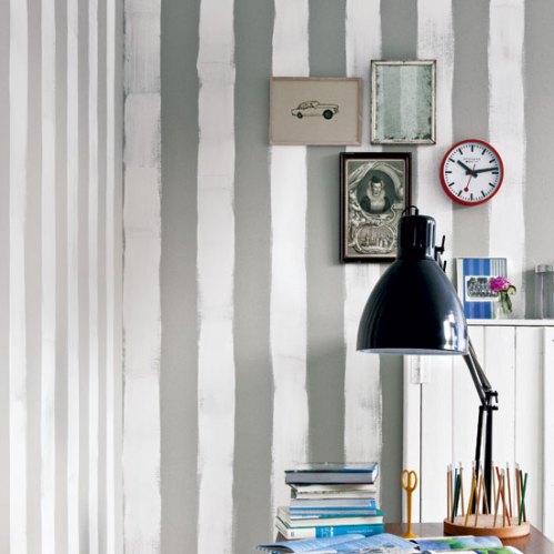
"Messy" stripes from Living Etc.

You guys know I really like painted or wallpaper striped walls. It’s a reoccurring them here on the Tudorks blog. I like stripes. They’re visually striking. I came across this gray and white room on Living Etc. I love the gray and white stripes, this is a nice neutral color combo. This office or studio is a bit masculine they way that it is decorated here, but you could pair this with a robin’s egg blue or pink to make it more feminine.

Yeah, gray and white = nice color combo. But, that isn’t what I really love about this little room. It’s the stripes. Love the messy, freehand stripes. This would be so easy to do. I can tell that the white was added over the battleship gray. Stripes don’t have to be perfect. And if you are a DIYer like us, then you probably won’t get perfect even if you tried. So this is “intentional” messiness. All you need to do is to get your spacing right, don’t worry about a crisp edge. I also like it in this Living Etc. room because it seems to be an office or a studio. We see art supplies and these stripes are creative, resembling an artist’s brush strokes.

So, what do you think? Do you think this would look silly and like a 5-year-old did it, if you saw it in person? Or do you think this adds a cute quirkiness to a room? I think it is a nice take on stripes. I won’t be doing it because stripes in general don’t fit with our home.

Today I’m fine cleaning the bathroom. My nostril hairs are singed from bleach. I’m hoping to finish this bathroom someday! And then we have a powder room to complete…I’ve also had a stupid day filled with spiders and smashing my thumb in a 1930’s solid wood door, the same door that broke my toes this time last  year.

-Victoria
Read Full Post »

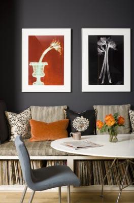
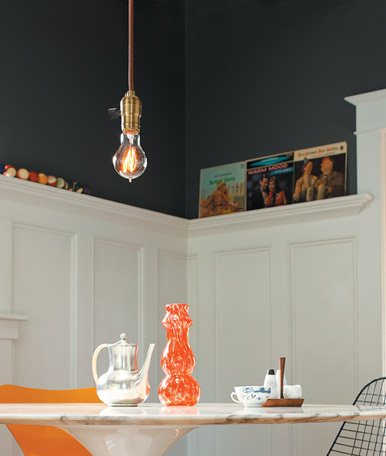
Blue & orange. If you know a thing or two about the color wheel then you know the BAM! that this complementary color scheme has to offer. Blue and orange are definitely a color trend now in film, video, media. Think CSI Miami! Anyways, here are 2 young but not juvenile dining spaces with deep navy walls the perfect accents of orange. This rooms also have something else in common: records! Being a vinyl hoarder, I love to see records used in design.

Celerie Kemble dining nook

The first room is from designer Celerie Kemble’s portfolio. This is a cool space. It’s a little more modern than what I do, but it has vintage. OK, so the room isn’t “navy” but it is a bit of squid ink paint shade, so there is some blue in that gray. This gray appears more “blue” with the touches of orange. I love dark gray walls. It is a bit of a “modern” shade and it can come across as very masculine, but it packs drama. You want to transform a room in a weekend, paint it this color. Everything you own will look completely different. Whites will pop and blacks will shine. Anyways, I love the record storage in this nook! It is so clever to have it under the seating in a small space. I got to tell David. He need to build us one of these.  Anyways, this is a cozy space, very hip. I want to listen to records and lounge around drinking beer and eating guacamole and chips in this nook. *Oh, I love the textiles in here because it keeps this color combo and space from being too masculine. It’s a nice balance.

The other dining room or nook is from Rejuvenation’s website. It is a really cool space as well and totally reminds me of the early 1910-1940’s Craftsman homes in the Seattle area being fixed up by young adults like ourselves. (Rejuvenation is based in the PNW). This dining room is the kind of dining room you’d see in our neighborhood while your taking the dog out for an evening stroll. It’s classic but it has a special type of vintage lust seen in the under 40 crowd. I guess what I’m saying is that I love the look of vintage mid-modern pieces shoved into a Craftsman. The cool thing about this space is that you remove the furniture and the accessories and you have a classic Craftsman home that appeals to everyone. You didn’t do anything to ruin the vibe or the bones of the house. You worked with the house and added your tastes without destroying the authenticity of the home. I’m all about that.

Rejuvenation dining room

Anyways, I love this room. Once again, it is a “squid ink” shade that looks awesome against that white mill work. The orange accents are brilliant in this room. The lighting isn’t very typical of old homes but it has a nice vibe, a young vibe. I love the records on the ledge (recognize a few from our own collection). And one can never go wrong with a Saarinen table.

I guess we are going to try to finish the upstairs bathroom this weekend. I have to admit that I’d rather do something else, you know, like something fun. Oh, well. This house isn’t going to renovate itself. Bummer.

-Victoria

Read Full Post »

I used to think that dark rooms only existed because they photograph well. I thought that “real” people didn’t have dark rooms because they didn’t look good in “real” life. I’ve painted a few rooms in our home dark. They look just as good in my working home as they do in pictures. Dark colors have so much impact and drama. This is why I’m attracted to the two featured here.

Design Sponge living room

This first room was featured on Design Sponge. I love the slap in the face of hot pink. It is stunning. Not much more to say. This is about the color of our living room, or at least the color that it appears in pictures. We have a bust of Napoleon painted that shade of pink on the built-ins. Napoleon really adds something. I am all about contrast anyways. That’s why I like black and white floors, zebra prints, and wild trim colors.

Anyways, I love this room. The colors are amazing. It is sophisticated but still very “young” feeling without being too perky. It has a certain moodiness. Oh, and great lighting too. The thing about dark rooms is that you need many, many different light sources: overhead lighting, windows, floor lamps, table lamps, sconces, candles, anything that gives off light. Different light sources transform the room and makes so many different “moods”. This room also uses texture nicely. You have a glossy hot pink coffee table, painted floors with a sheen, fuzzy maize throw pillow, mysterious silky purple throw pillows, and matte walls. It all works so nicely together and adds so much interest.

The other living room was featured in Homes and Gardens. It has the same feel of the Design Sponge room. It’s dark with these shocking bold colors and diverse textures. I assume that this room is hand painted but it may be wallpaper.

Homes and Garden living room

I don’t recall. This room is all about the walls. Of of the colors are taken from the design on the walls. I love chocolate brown and chartreuse together. The fuchsia adds so much too. The textures are so luxurious but the colors are a bit unexpected. Somehow this room has crushed purple velvet chairs but it doesn’t look like a blaxploitation pimp decorated the room . (Actually the room would probably be much more fabulous if it was decorated by a pimp character actor). Anyways, I love this room because it takes so many “me-maw” elements such as throw pillows, “wallpaper”, glassware, “slipcover” upholstery, and this formal living room still looks “young”.

These dark rooms do have something else in common: they are both large with tall ceilings. I think this is another reason why these rooms don’t feel claustrophobic.

-Victoria

Read Full Post »

As usual, Frink is overseeing the renovation.

We finally removed every trace of the layers and layers and layers of retro-fabulous wallpaper from the dining nook! We may have resorted to an electric sander with a buffer pad and diluted Mrs. Meyers cleaning products, but we did it. Since then we’ve had the windows replaced being that the ones that were there had some homemade mess of glass that was caulked together. We painted the room a dove gray mistint that I love (less lilac than the picture). I am going for a swank early 60’s Hong Kong hotel, think the decor of the hotels featured in the series I Spy. I got my wish and it will be fantastic. I didn’t realize that most of the things we own fits in the “swank early 60’s Asian hotel” category.  I’ve started decorating this space. I’m not finished. Does one ever stop decorating their space? I’ll show those pics when I get there. I desperately need a sputnik!!!

I just wanted to share this little accomplishment. I can now eat dinner at a table. I haven’t had that in 7 months.

-Victoria

Read Full Post »

I apologize for the infrequent updates. Life is happening and we are keeping busy. We have completed so much and I hope to share that with you guys soon.

"Frame Collage" featured in Martha Stewart magazine.

"Frame Collage" featured in Martha Stewart magazine.

The “great” room or that formal living room that I long for, is not finished. We’ve ignored it because we have had so much to prioritize and work on. I mean what is more important a kitchen or a stuffy room that only houses books? There are a few things we need to do to this room. We have removed the carpet, staples, and some crazy thing covering the original mantel. We now need to trim down the built-ins because they are a bit goofy, replace the mantel since it was removed and covered up with some ugly 70’s thing, and prime/paint the walls. I want this room to be formal, stuffy, and a bit menacing. I want a shade that reminds me of forest mushroom of the rocky coasts of Washington. I guess what I am looking for a is gray brown or maybe more of a brown gray.

While browsing on marthastewart.com, looking at Frenchies and admiring color combos, I came across these 2 rooms. I love both of these mushroomy, putty, seashore brown grays. This first one is a bit lighter. I can’t tell if it is from the lighting. I really didn’t expect this shade to pair nicely with a pale floor and it does. Despite the boring frame collage, I like what I can see of this room. This shade is a great neutral. It mixes well with crisp white, wood tones, and espresso. It’s a bit lighter than I want to go for the big room we have to work with, but I do like it. I would of loved to have this elsewhere in the house.

The second room is quite dreamy. This is the exact color that I want for the formal living room. It’s moody, dark, formal, and slightly rustic. I want to find this color. I’ve been mistint searching again and I haven’t found it yet.

Perfect brown gray shade.

Perfect brown gray shade.

I guess I am going to have to give in and actually get a shade mixed. I may just have to give up on my dreams of painting the entire house in mistints. Anyways, back to this perfect color. Look at how nicely it pairs with pewter, white, tea stained white, and black! This is the exact color I want. I haven’t’ decided if I’ll paint the built-ins putty or the too bright white trim paint that David chose. I guess I should get the room color first.

-Victoria

Read Full Post »

I’m learning to love neutrals again. I always wear neutrals but usually prefer brights in the home. I guess I am growing up because I can’t get enough of elegant neutral shades ranging from taupe to rocky cliff gray. It’s that sea pebble addiction that I have. The dining nook will be painted a gray shade and I hope it turns out nicely (this is one of the last projects on the list). Neutrals create such an elegant backdrop for all of your things. I do love my stuff.

Coastal Living dining room

Coastal Living dining room

This first room is amazing. I love this formal dining room found in Coastal Living magazine. The millwork is amazing I really do love the choice of colors. The lighting isn’t too shabby either. I could live without that hokey hardware on the buffet and I want to slap whoever spray painted that antique mirror, but hey, it’s a beach home. Beach homes think they can get away with that kind of stuff. I think I am going for this shade because it is so beachy. It’s beachy without being a vacation home shade. We often forgot (somehow) that we live less than 4 blocks from the sea. This is novel to us since we are from a landlocked area. The locals don’t get it because it rocky beaches don’t feel beachy. But, anyways. I thought this was a room that was well executed.

The 2nd room is something from apartmenttherapy.com. I mainly care about this pic because of the buttermilk Frenchie resting under the chair like a big knot on a log. Anybody with a French bulldog has great tastes, right? 🙂 Well, one I got pass the “him a cute baby” phase of looking at the picture, I realized that I like the colors used as well. They are neutral and really bring the room together without being intense.

Apartment Therapy living room

Apartment Therapy living room

It’s a cute room and I love that they chose a softer white to paint their trim with. This adds so much class. I’m a sucker for putty shades. Every time I see them in use, I want to paint the entire house in these colors. Off subject: I know people love the color coordination of books but it is my pet peeve. Why is that? I organize mine by type, like a library would. I just don’t like the color thing because it is like you don’t read, you just look. Maybe you can remember a book by its cover but I don’t. What do you do with a Pocket Poet’s series?

-Victoria

Read Full Post »

It’s funny because I have found that I have many style twins. It’s purely accidental. I sometimes wonder if it is a sign of a mental illness and if the updated DSM-IV includes check off boxes that I am unaware of such as “strange desire for all things animal print”, “love of pets in clothing”, “inability to accept Ugg boots and short denim skirts as appropriate attire”, and “love of anything creepy and old”. Because of the internet I am know aware of my style twins, especially with clothing. It’s made the world a smaller place. I find that I have more in common with people than I thought I did. Anyways, I have a subscription to Sunset magazine and earlier this year (2009) they ran a piece on designer Sheri Sheridan’s home. I had to laugh out loud and share the article with hubby. Here was another style twin or at least we were shopping at the same place (thrift stores, antique stores, and Z Gallerie)! My husband laughed because she had a sunnier more Californian version of our dreary Northwestern bungalow. Same accessories just different colors.

Sheridan's living room

Sheridan's living room

I of course clipped this article from the magazine to put in my “style book”/inspiration book. Her living room definitely reminds me of ours. We have the same couch but with zebra print pillows. We have a furry rug which matches her furry pillow. I have the same  Z Gallerie ram’s head, one of my favorite finds ever. (In fact, everything that I have ever purchased from Z Gallerie she has in her home). Put a Frenchie in place of that dalmatian and you’ve got my home with my future pup.

The article has most of her home pictured. She has some bold colors. I am not wild about the blues because they aren’t minty enough and she has a yellow room and I don’t do yellow. It will take me some time to get used to that since I grew up in a home with yellow interior. And she isn’t in Washington. I don’t think those colors make sense here but I see them really working in California. But, throughout the home she has great knick-knacks and furniture.

One of my favorite rooms is the dining room. This is kind of how I plan on doing our dining room in the new house. I love the Saarinen table, this will be one of our first investments but I think I would settle for a knock-off even though I hate Ikea. I plan on doing the mismatched chairs as well just because I love refinishing chairs. I love the gray walls and I’ve already purchased a mistint in the perfect shade of grey. We plan on splurging on a Sputnik lamp/chandelier, a small one. Our dining nook is small and I want it to be elegant shades of white and grey. I’m still searching for a cute tea cart. There is a built-in corner cabinet with leaded glass. However, it has been coated with faux wood contact paper inside. Ughh, I hope that is easy to get rid of. I wanted to paint the inside of the built-in a color to make my favorite black and white knick-knacks pop, but I still don’t know what shade. Any suggestions? It will definitely be a mistint.

Sheridan's dining area

Sheridan's dining area

You can see the entire article here. I love it because she has some great finds, many affordable tips, and she paints her home in mistints. Love it, it’s classy and on a budget. It’s the kind of home you see in a magazine and go “that can actually work for me” or “hey, another style twin”.

-Victoria

Read Full Post »