Feeds:
Posts
Comments

Archive for November, 2009

I love mustardy yellow ochre shades but I have never “played” with it when it comes to decorating. It really doesn’t work well with the colors that we have used in the interior. But, man I love it. I like any color that reminds me of decaying leaves on the forest floor.
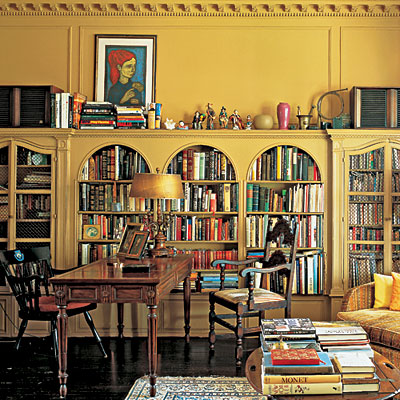
saccentslibrary

Southern Accents Ochre Library

This first room is a library from Southern Accents (RIP). This is one detailed room. I really do wish that the trim and some of the millwork was painted in a contrasting color such as white or espresso to really make it pop. I have no idea why they are trying to understate its magnificence. We pedestrian people would about do anything for a room with this much architectural strength. But, anyways. This ochre works so well with the rich patina of all of the wood tones. It really creates a luxe color palette. I also love the pops of vermilion and teal. This keeps the ochre from being too “stuffy”. I also love these ornate built-ins and the touch of the chicken wire is nice. It’s a great room. It really has an old world charm that the ochre helps to bring out.

This other room is really trying to sell the McCoy lighting fixture from Rejuvenation. This is a tiny dining space/kitchen that I love. I love the lighting and if I had a space that would work with pendant lighting, I would have to use some of this antique industrial inspired lighting. (I am considering the boudoir but I am fearful that I would bump head). This ochre color room, with the perfect lighting, looks great with wood tones too.
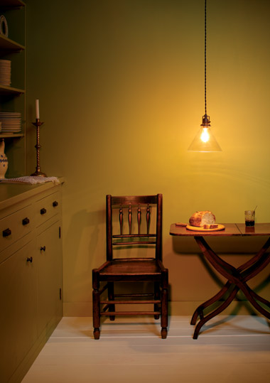
rejuvenationmccoy

kitchen featured in Rejuvenation

The room is a bit plain since it only exists to sell us the lighting fixture. The fixture is the only work of art allowed. But, throw a early modernism painting on that wall and this room is complete. I also love how both of the rooms play with warm tones metals. Ochre is just meant for those.

I know I say that I am not ready for yellow. But, I think I may be if it is ochre. It is growing on me. And like other “cheery” shades, it must be mixed with woods and warm metals to keep it from looking too gingham country cottage or shabby chic.

-Victoria

Read Full Post »

I don’t really do “color”. Just look in my closet. It is a collection of black and gray; however, you will see some orange and coral peeping out of that abyss. I have a thing for orange. I would love to have an orange room but it isn’t really fitting with the scheme of things right now. But, I can admire it and plan for the future, right?

marthafoyer

foyer from Martha Stewart

This first little space if from Martha Stewart’s website. I love the bold harvest orange with the crisp white millwork. This really pops. I love it against the deep wood tones. (That being said, I love anything against deep, rich wood tones). But, yes. This is a great space. I adore the curiosities displayed on the walls and love their bold, graphic, and simple frames. What is that black/espresso stuff lining each edge? I think the website said it was ribbon. That’s a bit odd and time consuming, I imagine. I’m sure it would look silly in real life but it takes a great picture. I would personally just painted it. This is a nice small foyer, about the same size and layout of the one that we have. Currently, it is housing a dark ladder back chair until I find that perfect something. I still do not what that something is.

The other room is a living room from Southern Accents (RIP). This room has that colonial feel but it is really fun and vivid with the walls that harvest orange shade. This is another example of how nice this color goes with white millwork (doesn’t everything). I like to see orange look this formal and not like an Ikea show floor. Orange has the potential to really look elegant without being too immature or “modern” a.k.a Target’s “dorm” collections. It works nicely with deep woods and some rustic pieces. I must mention that this chair in this room is very weak. I am not fond of “skirts” but the chair could of benefited from a print or even another bold color such as ochre or brick. However, that’s my opinion.I can never look at a room and think that is perfect and to my liking. I do the same to my own space. Perhaps that is one of the many reasons why this is taking so long.

saccentorangelr

Southern Accents harvest orange living room

-Victoria

Read Full Post »

The door before- Missing a Speakeasy, conveniently illustrated by our inspector.

The door before- Missing a Speakeasy, conveniently illustrated by our inspector.

Oh, what were we thinking when we bought this house? What a mess! It is still a mess but it is easy to forget what a mess it used to be! We have encountered so many weird things that I know other renovators haven’t dealt with. Our front door had a huge hole in it from a missing speakeasy. The other side was covered with black faux fur over 5 inch foam, under that a layer of faux wood contact paper, under that tons and tons of paint.

We thought we were going to have to find a new door. It is not OK to have a huge hole in your door and it is not OK to have a custom van inspired front door. After going door shopping, I was not impressed. I really don’t like new doors. They are ugly and lack character. I found a few cool Medieval looking doors with menacing grates for $1200. This is cool and all but doesn’t fit the house and I can think of better things to do with $1200. I also love wood. I’m so over this “energy efficient” man-made doors. I mean how much energy can I save from a door when my house is 70 years old, has lead windows, and no insulation? And I know these doors can’t be made of biodegradable substances. Our messed up door is made of solid wood.  Luckily, we have found the original speakeasy hidden under a mound of hoarder junk. But, like everything else in this massive project, it isn’t that easy. The speakeasy is nice but we are missing the back. We’ve been searching for the back either original or reproduction. I love it’s deco details and it matches the original hardware throughout the house. We found a cast iron speakeasy at a bargain building store. It’s lovely but very Norwegian and doesn’t fit the style of the house or the hole in our door. We are still searching. Some of our neighbors have the same speakeasy as us. I’m about to have an artisan cast the backside…

The door was water damaged, so we thought. David sanded that right out. It is amazing that it was in the shape that it was considering the moisture level of the PNW. David painted the door with a wonderful mistint we found at Home Depot ($5 gallon). It was the exact color that we had wanted. It also had the primer mixed in and went on rich and evenly with just 2 coats. (FIY, it was Behr, much better than my Lowe’s mistints). David cleaned up the original hardware. It wasn’t green! It actually appears to be a stainless steel finish, very modern. We purchased a kickplate to match and to cover up the less than perfect bottom part of the door. David took off the terrible glass door which was never installed properly the 1st time around. The door looks very different from the outside. I think it will look very nice once the exterior is finished.

Now to the interior portion of this front door, not perfect. The wood did not stain up nicely so we painted it the same exterior red shade. It’s classy. The back of the speakeasy is covered with aluminum foil. It does not keep that cool Pacific wind out and it looks awful. Oh, well. I’m still hunting.

I’m happy that we were able to salvage the door. We are all about working with what you have. Why create more landfill waste or spend too much money? So far we have spent about $35 on the door. And here it is (before the exterior paint job)…

frontdoor

-Victoria

Read Full Post »