Feeds:
Posts
Comments

Posts Tagged ‘bold color’

Candadian House and Home purple dining room

I don’t think I own anything purple when it comes to home decor. I only own a few purple clothing items. I like the color but it is a shade I find intimidating to work with. I don’t know why. I’ve found 2 very fun and slightly formal purple dining rooms that help me see the potential of purple.

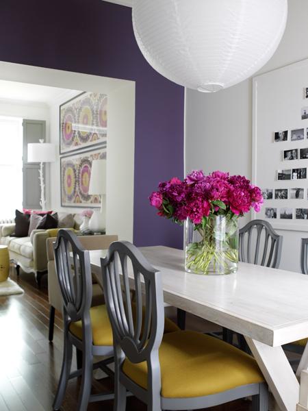
This first dining room is from Canadian House to Home. This room is a deep, royal purple shade. It feels light and airy against the white trim and the white wall. I love the mix of white accessories, including a thrifty white paper lantern. The colors paired with this royal purple make this color workable. I love it paired with that 70’s goldenrod shade and cool purpley cement gray. And and don’t forget the temporary pop of fuchsia from the fresh flowers on the table.This room is purple room that I can see easily replicated in a “real” home. Now to the other room…

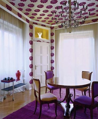
The other room I found on the blog, Roomenvy. This room is a bit more “busy” than the Canadian House and Home one. I love a bold and obnoxious wallpaper. So does the owner of this dining room. There is purple printed wallpaper on the ceiling. This isn’t that innovative, being that is a very old-fashioned thing to do. And may I add a bitch to remove. It too us forever in our dining nook to remove layers and layers of wallpaper off a small part of the ceiling. Anyways, I like this dining room because it is over the top, right down to the royal purple rug. This isn’t fitting for my home and I’m sick of seeing bold colored shaggy things. Do you remember our blue faux fur covered cabinets? Well, I do and I’ll

Patterned purple dining room

never see shag as something quirky or retro again. So, this room isn’t something that I see easily being replicated in a “real” home but it is fun to look at. I could easily see a “real” dining room incorporating this bold print on fabrics and maybe having a yellow/goldenrod painted walls.

Sorry about the lack of posts lately. I’m doing what I can to wrap up some of these projects before I go back to work. That’s keeping me very busy. And they’re boring projects too. Like cleaning, scrapping, touching up projects. These aren’t those creative projects that I crave.

-Victoria
Read Full Post »

I’ve craved quirky and bold color combos lately. I blame it on summer. Summer makes me go for crazy colors. That’s what got our home in the mess that is in 🙂 I chose the colors during the hottest month in the PNW. We ended up with overly energetic/obnoxious colors. I spent most of the winter months hating them/criticizing my design choices and now I love them. My house would be fluorescent/day-glo if I lived in a warmer and sunnier place.

Colorful room with pink floors

I have found these two rooms on-line. I love them. They are wild and unexpected but still classy. They don’t look “dormy”! This first room is bold. I can’t remember where it came from. I wish I knew because I would love to explore the entire house. You don’t get any bolder than paining your floors hot pink. And you definitely don’t get any bolder than painting your floors hot pink and your trim yellow and your walls with polka dots. I’m in love with this space. It’s so bold that even I don’t know if we have the guts to “go there”.  This is my dream interior for a New Orleans row-house or a Caribbean mansion. I love the insane-o colors mixed with the dark woods (mega-contrast). The “accessories” are so classy but unexpected with the colors. I mean wouldn’t that chair with the pink upholstery be bold in any room? In this space, it is looking very tame. And don’t you love those chintzy rose curtains? It adds a needed shabbiness.

This other room is a bedroom found at Marie Claire Maison. This is another fun, quirky space with lots of hot pink. It’s much less bold than the room featured above being that the floors aren’t Barbie pink and the walls are a neutral color. This Marie Claire room is all about the accessories. They transform the space. I think this an adorable room for little girls and big girls. My weakness is bold painted trim. It’s easier to do than what people think and it

Marie Claire Maison quirky pink bedroom

totally changes a space. I wish we did the trim crazy throughout our house. I did one room but I wish I did the entire house. I need pink trim throughout the house 🙂 This room has so many quirky accessories and textiles. This room is all about the “treasures”. These treasures add whimsy to the room. They are cute but they sure are creepy. That’s my favorite genre for home decor. I love this bedroom because it seems so livable. It isn’t a huge room. This seems like a room that regular-ole folk could get even though I know that some of those accessories are pretty darn pricey. *Note that creepy baby doll in the glass dome! But, I like this room because it can be transformed by switching textiles. You can also hide stuff under the bed and nobody would know. The shelf is a nice touch but I don’t think I can sleep like that. I’d be so paranoid that my $175 tray and all that glassware would come tumbling down on my face while I sleep. I do live in an earthquake zone, so that is a bad idea.

So, yeah, I hope that these rooms have inspired you just as much as they have me. I now know that there is no such thing as too bold. Just look at these 2 rooms!

-Victoria

Read Full Post »

I used to think that dark rooms only existed because they photograph well. I thought that “real” people didn’t have dark rooms because they didn’t look good in “real” life. I’ve painted a few rooms in our home dark. They look just as good in my working home as they do in pictures. Dark colors have so much impact and drama. This is why I’m attracted to the two featured here.

Design Sponge living room

This first room was featured on Design Sponge. I love the slap in the face of hot pink. It is stunning. Not much more to say. This is about the color of our living room, or at least the color that it appears in pictures. We have a bust of Napoleon painted that shade of pink on the built-ins. Napoleon really adds something. I am all about contrast anyways. That’s why I like black and white floors, zebra prints, and wild trim colors.

Anyways, I love this room. The colors are amazing. It is sophisticated but still very “young” feeling without being too perky. It has a certain moodiness. Oh, and great lighting too. The thing about dark rooms is that you need many, many different light sources: overhead lighting, windows, floor lamps, table lamps, sconces, candles, anything that gives off light. Different light sources transform the room and makes so many different “moods”. This room also uses texture nicely. You have a glossy hot pink coffee table, painted floors with a sheen, fuzzy maize throw pillow, mysterious silky purple throw pillows, and matte walls. It all works so nicely together and adds so much interest.

The other living room was featured in Homes and Gardens. It has the same feel of the Design Sponge room. It’s dark with these shocking bold colors and diverse textures. I assume that this room is hand painted but it may be wallpaper.

Homes and Garden living room

I don’t recall. This room is all about the walls. Of of the colors are taken from the design on the walls. I love chocolate brown and chartreuse together. The fuchsia adds so much too. The textures are so luxurious but the colors are a bit unexpected. Somehow this room has crushed purple velvet chairs but it doesn’t look like a blaxploitation pimp decorated the room . (Actually the room would probably be much more fabulous if it was decorated by a pimp character actor). Anyways, I love this room because it takes so many “me-maw” elements such as throw pillows, “wallpaper”, glassware, “slipcover” upholstery, and this formal living room still looks “young”.

These dark rooms do have something else in common: they are both large with tall ceilings. I think this is another reason why these rooms don’t feel claustrophobic.

-Victoria

Read Full Post »

I have learned recently that there is not a color out there that people hate more than pink. I personally love pink and I enjoy it in decorating. I have been shocked by other people’s reactions of pink. For example, I have painted my super tiny “boudoir” pink with a khaki trim. People look in and go “Did you mean to do that?” or “Wow, I assume that you haven’t gotten to this room yet.” That was one of the first spaces I worked on and yes, I meant to do that. I have witnessed people’s faces cringe at my choice of pink. I find their reaction entertaining and very odd. After thinking about this much too long, I have came to the conclusion that people are either A. very boring and narrow-minded. They can’t think of pink for anything other than a pretty-pretty princess little girl’s room. They aren’t willing to detach pink from prissy pig-tailed little girls and see it as an unexpected color to use and B. people hate women. They hate things that are associated with femininity. Men think being in a pink room shrinks their balls and women think that they are weak if they like pink. They think it means if they say they like it then all of female kind will go back to being a stay-at-home baby factory that was lucky to get a high school diploma. OK, so maybe both A and B are very harsh, but I do think that people have some very set stereotypes and “hang-ups” with pink.

I like pink. I feel I can embrace it. I can embrace it as a bright and unexpected color to use. So far, I have been very happy about my pink choices. I have found these two pink dining rooms. I like them. But, somebody should let them know that they will never resell the place if they keep the colors this way. If you are going into foreclosure or something like that or if you really don’t want your house to sell, then paint your rooms pink. People can’t get past it!

Betsey Johnson's dining room

This first dining room is nice. It’s Betsey Johnson’s dining room, so yeah, it’s pink. I’m sure that I feel in love with it because of the sputnik lamp. I think I like any room with one. This room is very pink. It has a formal and somewhat 60’s vibe. I like this room but I do feel the pink is overwhelming and it should of been balanced out with more chartreuse and maybe more “gold” metals. It’s a whimsy room. And I love it with the “dark” lines of the table and mirror. Ohh, I need a sputnik for our dining room.

I think this other room came from Cottage Living magazine (another RIP magazine). Once again it is a room with pink, acid green, and dark contrasts. It is fun and I think this home is in California. A place with lots of sunshine can pull off these colors easily. Pink really looks great with wood tones.

I don’t really think that either of these dining rooms are “timeless” but I do think they are fun. You could keep all the furniture, linens, and accessories and change the color of the walls and get an entire new room. That is the power of pink. It’s just one of “those” colors. It can change an entire space. That being said, taking it away can change an entire space as well. I’m with my pink right now.

Cottage Living dining room

I have to ground it with neutral colors, woods, and creepy objects for a grown-up look. My husband doesn’t mind all the pink either. That’s good. I did marry a guy that enjoys interior design and decorating, so I would actually be shocked if he didn’t like pink. Or perhaps he’s learned that marriage is more important than complaining about pink. I’m fine with either reason.

-Victoria

Read Full Post »

I find myself spending more and more time searching for “rooms” online than I do fragrances/cosmetics. Oh, how I’ve grown! Today, I’ve found two rooms that are heavy on teal and chartreuse and I like them. anthropologiejade

The first is a room courtesy of Anthropologie. It is an elegant use of all of those thrift store decorations we have around. I am completely aware that this is a staged room and that it has never had to be functional. It only exists to sell expensive things upholstered in bold me-maw-ish fabrics. But, I do like the color combo. The walls are rich, a peacock blue, that I would of never chosen. It looks a lot like Benny Moore Jade Garden or North Sea Green. It looks great with the pops of chartreuse. Blue and green are the only colors used and I like it. This room is very cozy but doesn’t look like a bunch of tea roses threw up in your shabby chic cottage. I like the mix of prints. They are bold, really 70’s and if I saw this room when I was 16 and wearing polyester burnt orange plaid pants and thrift store tees, it would of been my dream room. I appreciate this room for its cool color scheme but I do find it a bit matchy-matchy and I won’t be trying to recreate it. But, I might “borrow” from it.

The second room is a Jonathan Adler dining room. I like this because it is bold and graphic yet still simple. This I could live with. It has a lot ofadlerdiningroom color only because of the bright furniture and curtains. (I must add that I am not a curtain person. My granny is a curtain addict and I have to say that her obsession has forever made me stay away from them). This room is matchy-matchy too, the curtains match the vase. (Personally, I’d rather see an orange vase or even a black vase, but hey, I never find a room that is perfect. I mean don’t get me started on the glass top dining table) I love the black doors. The home we are getting does have doors that are painted black, but they are in the “porno” room. Who knows, maybe I’ll keep them black. Anyways, I am attracted to this room just because of the teal and green. It’s young but it still looks formal. I think I really like a bold “in yo face” contrast. I’m trying to out grow that but I can’t. I’ve got to take this one step at a time. I mean I only outgrew Claire’s with all of their pink plastic heart hair accessories  like 1.5 years ago and I should of cut that tie at least 5 years ago. These things will take time. I’m a growing gal and all. Look at me, buying a house and all but I still have to have some fun. So, now to counteract all this grown-up house stuff, I’m going to go beautyhabit.com and fall in love with all the new releases and be frivolous and stuff.

-Victoria

Read Full Post »